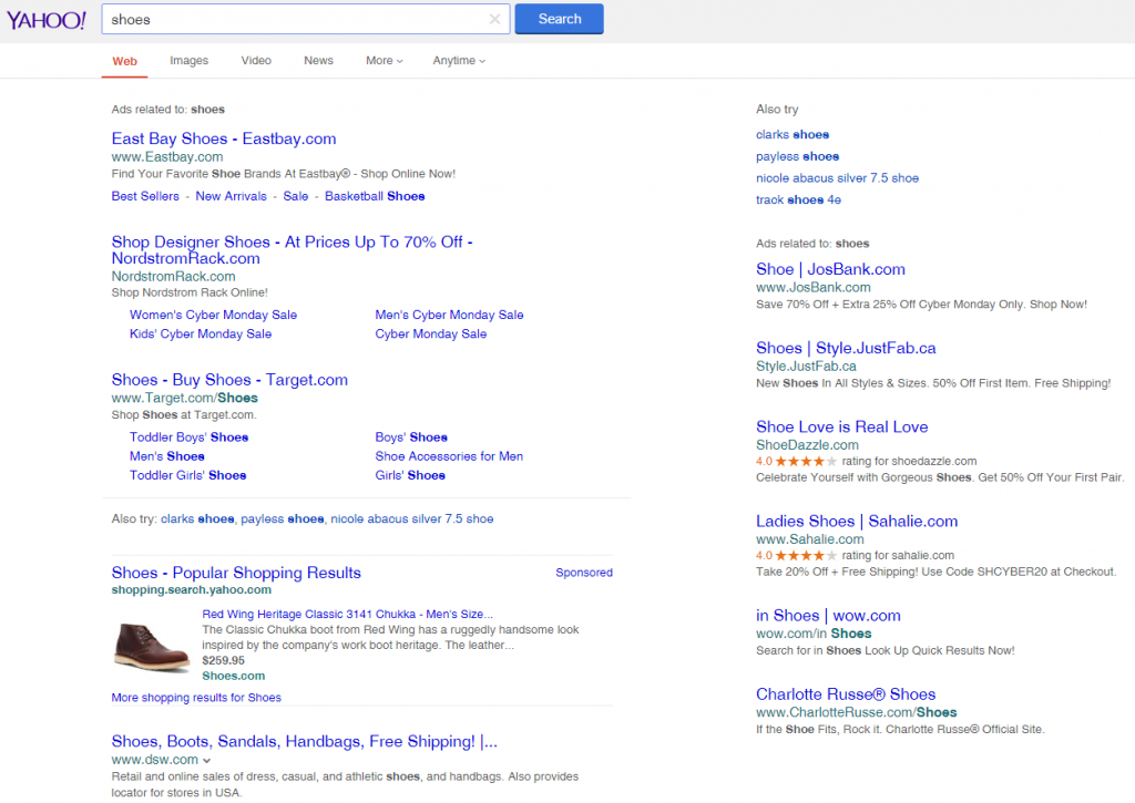
 Yahoo is testing out a new style of shopping ad (PLA), and this one closely mimics a regular search result.
Here is their new style.
 It includes a title along with a traditional description snippet, a line with the price, and then the URL. It looks very similar to an organic search result, as well as their own Yahoo results, which also feature the thumbnail.
The sponsored is in the top right corner, which makes it slightly less noticeable, particularly since a searcher’s eye would normally be drawn to the image in the ad unit.
Here is how it appears within the search results page.
 This seems to be independent of Bing, as Bing is not running the same ad style in their search results.
It also appears to be only in testing. This was the only search I was able to trigger this new style of ad on. Most showed the standard multi-item box in the right side bar, which only adds a thumbnail, business name and price.
Yahoo has been trying to increase their revenue from search and trying out all kinds of different ways to present their search results seems to have been a high priority for them.
Jennifer Slegg
Latest posts by Jennifer Slegg (see all)
- 2022 Update for Google Quality Rater Guidelines – Big YMYL Updates - August 1, 2022
- Google Quality Rater Guidelines: The Low Quality 2021 Update - October 19, 2021
- Rethinking Affiliate Sites With Google’s Product Review Update - April 23, 2021
- New Google Quality Rater Guidelines, Update Adds Emphasis on Needs Met - October 16, 2020
- Google Updates Experiment Statistics for Quality Raters - October 6, 2020