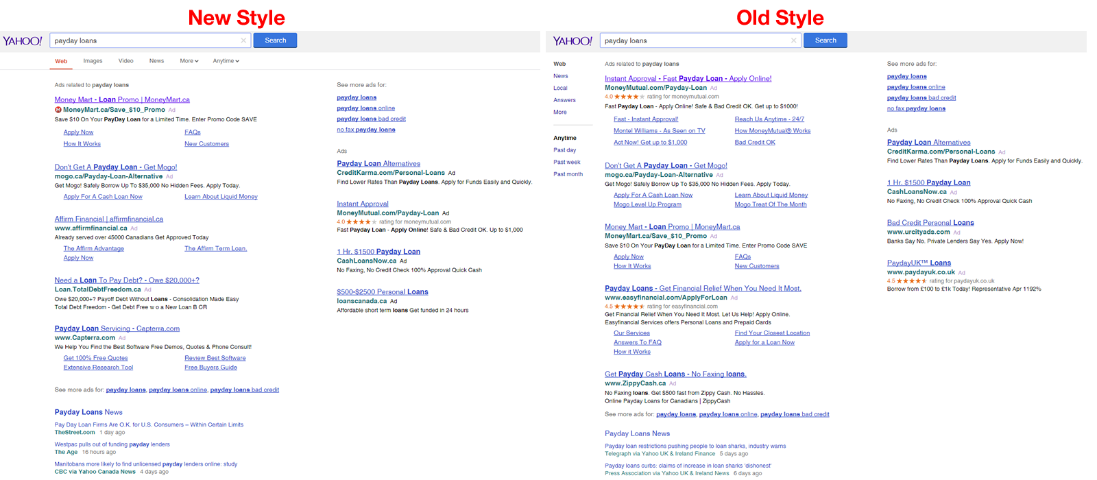
 Yahoo is testing yet another variation of Google-like search results.
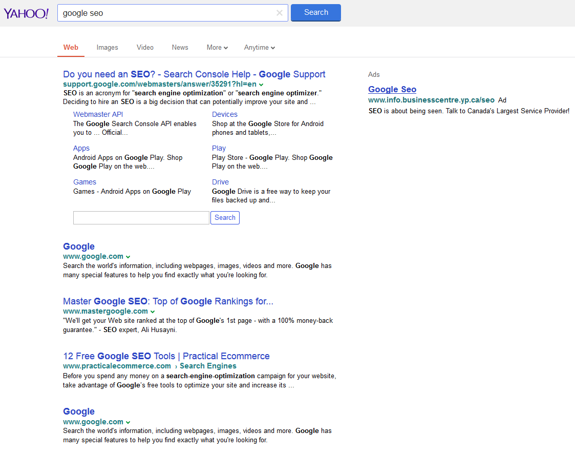 This change seems like it could be permanent, or if not, they are doing a large scale test at the moment, as many people are seeing the new Yahoo UI.
When you consider Marissa Mayer, Yahoo’s current CEO, was behind many of the UI design choices at Google, it isn’t surprising to see Yahoo switch to a very Google-like interface.
Here is the comparison between how Yahoo usually looks and the new Google-like look.
The “More” drop down menu also allows Yahoo to include many more areas of Yahoo than they have traditionally included in the sidebar, however with this change they are more hidden. But again, this is identical to how Google does it in their search results.
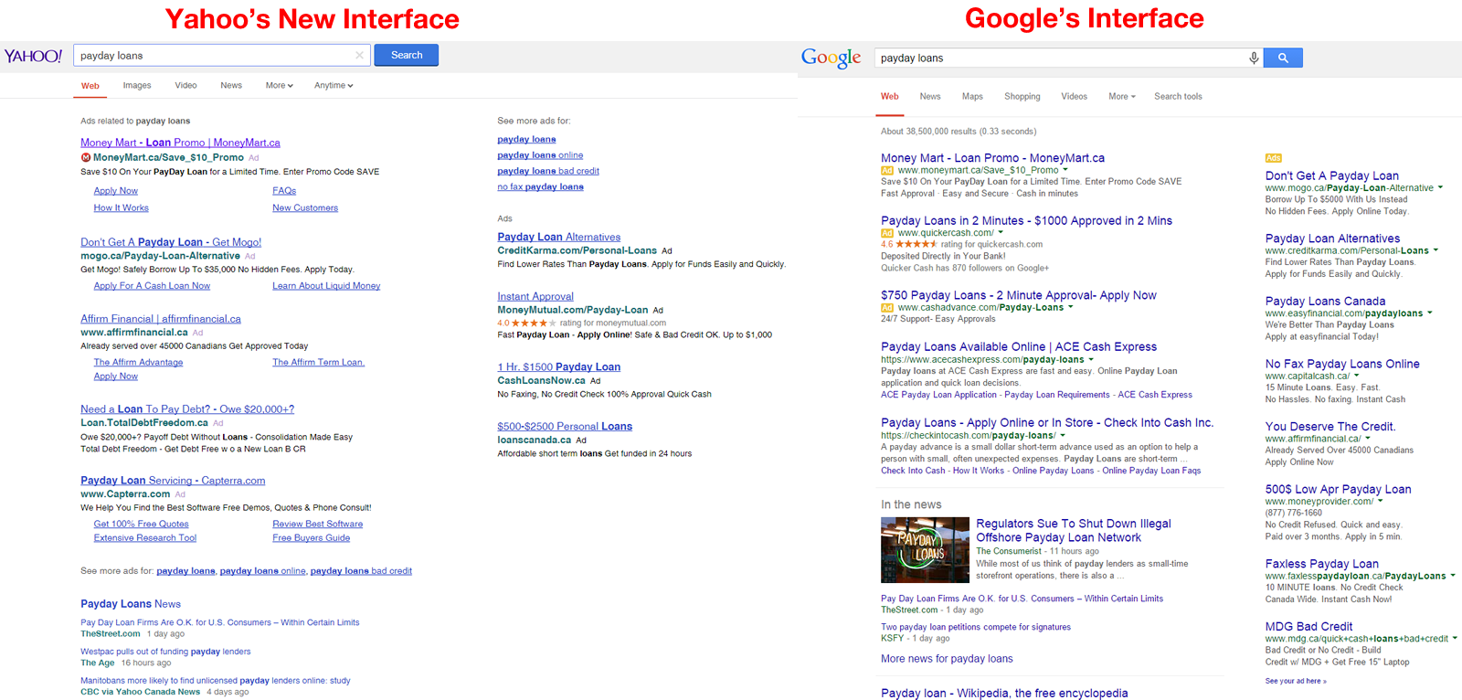
 Here is the same search compared to Google. The biggest difference is the fact Yahoo places five advertisements above the organic search results while Google only uses 3. So most users do see organic results “above the fold” for Google, but not with Yahoo – we don’t even see a single organic result.
Here are a few more examples.
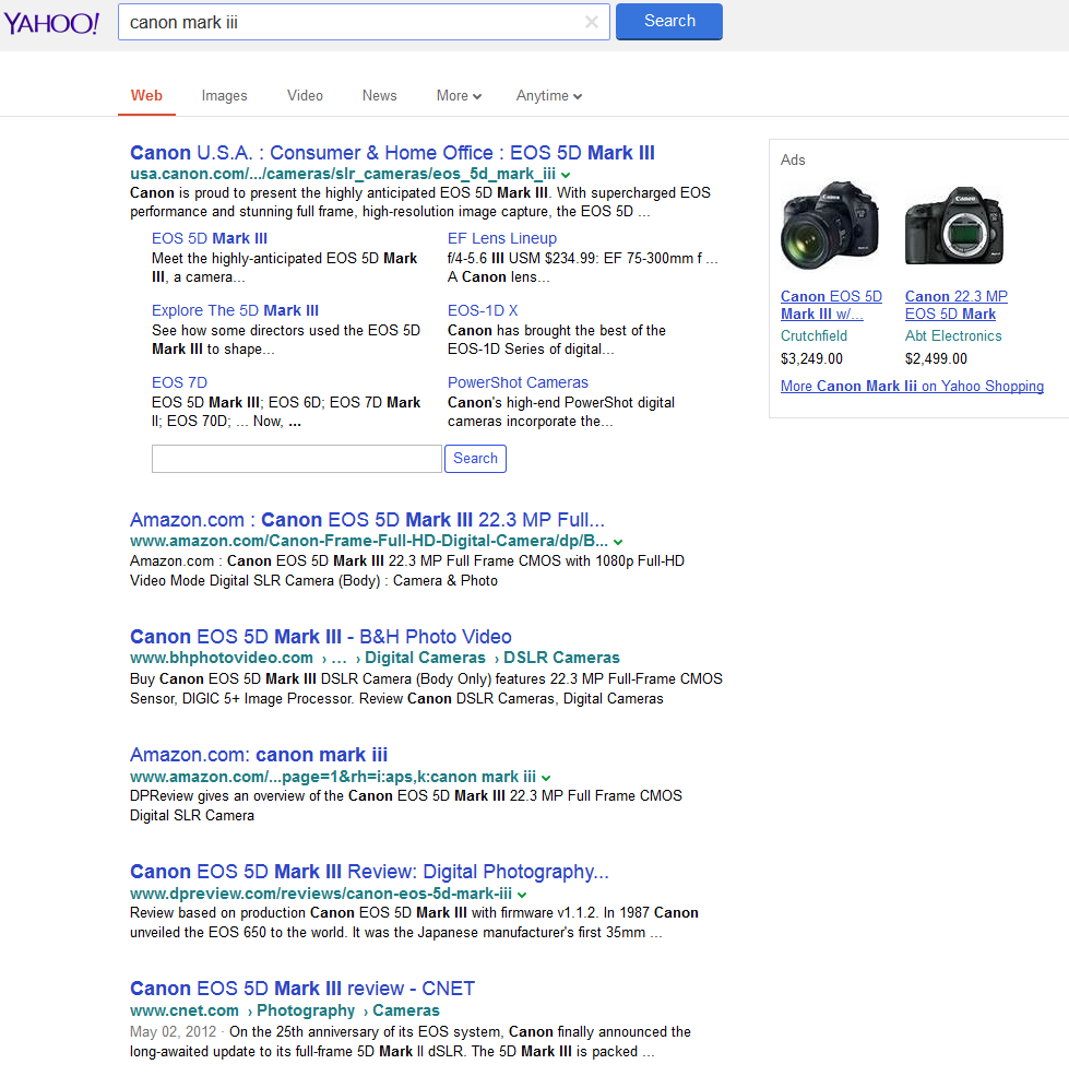
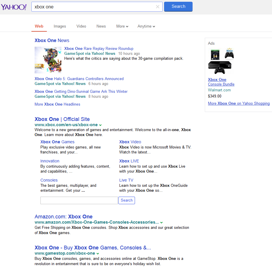 SERoundtable posted about another similar test run last month here. But you can see they are adjusting the search box and header as well.
