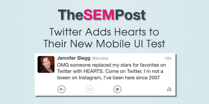
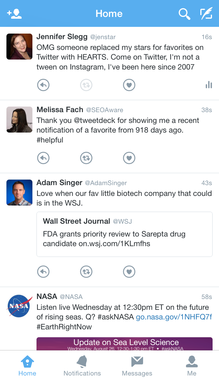
 Twitter is testing a new look to their mobile Twitter UI… and it will likely drive you crazy…. For starter, stars for favorites are gone, and have been replaced with hearts. And it doesn’t get much better from there, especially for regular or longtime Twitter users.
Yes, it definitely looks like they hired a teenage girl with a One Direction obsession to design this heart-laden UI.
When you click through to the notifications tab, you get full color heart emoji action.
 It does continue to show the number of favorites and retweets for tweets, but I do find the circle icons pretty distracting as a user who has been on Twitter since 2007.
 It also takes up much more screen real estate between tweets, meaning I am seeing fewer tweets on my mobile screen at once.
Here is a comparison from a few months ago:
 You can see just how much extra whitespace this is adding.
It isn’t clear if this change is permanent, or if you can revert back to the old style, especially for longtime Twitter users. But there is no option in settings to change it back. I can see how this heart UI would apply to a certain segment of their market, but having no way to change it isn’t good.
Twitter has really been working on a way to make the platform more attractive to the new and casual user, and hearts are slightly more intuitive for those used to the hearts on Instagram. But many of the things Twitter has considered trying could negatively impact their current loyal following.
Will this stick around? Perhaps. I could see them offering it by default to all new users. But considering this makes tweets less visible, not to mention the hearts, hopefully they make this optional for older users.
Added: And here is the background for the source of the test, via Pedro Dias.
Hearts is something @sacca suggested for Twitter. Now it's being tested. Follows last week's location search test. http://t.co/HDLjjyLXyV
— Jordan Novet (@jordannovet) June 17, 2015
Jennifer Slegg
Latest posts by Jennifer Slegg (see all)
- 2022 Update for Google Quality Rater Guidelines – Big YMYL Updates - August 1, 2022
- Google Quality Rater Guidelines: The Low Quality 2021 Update - October 19, 2021
- Rethinking Affiliate Sites With Google’s Product Review Update - April 23, 2021
- New Google Quality Rater Guidelines, Update Adds Emphasis on Needs Met - October 16, 2020
- Google Updates Experiment Statistics for Quality Raters - October 6, 2020
