 Google is testing a new card style layout in the search results. But those screenshots didn’t also show a local pack. And for those site owners who appear in the local pack, this particular test – especially if it becomes the standard.
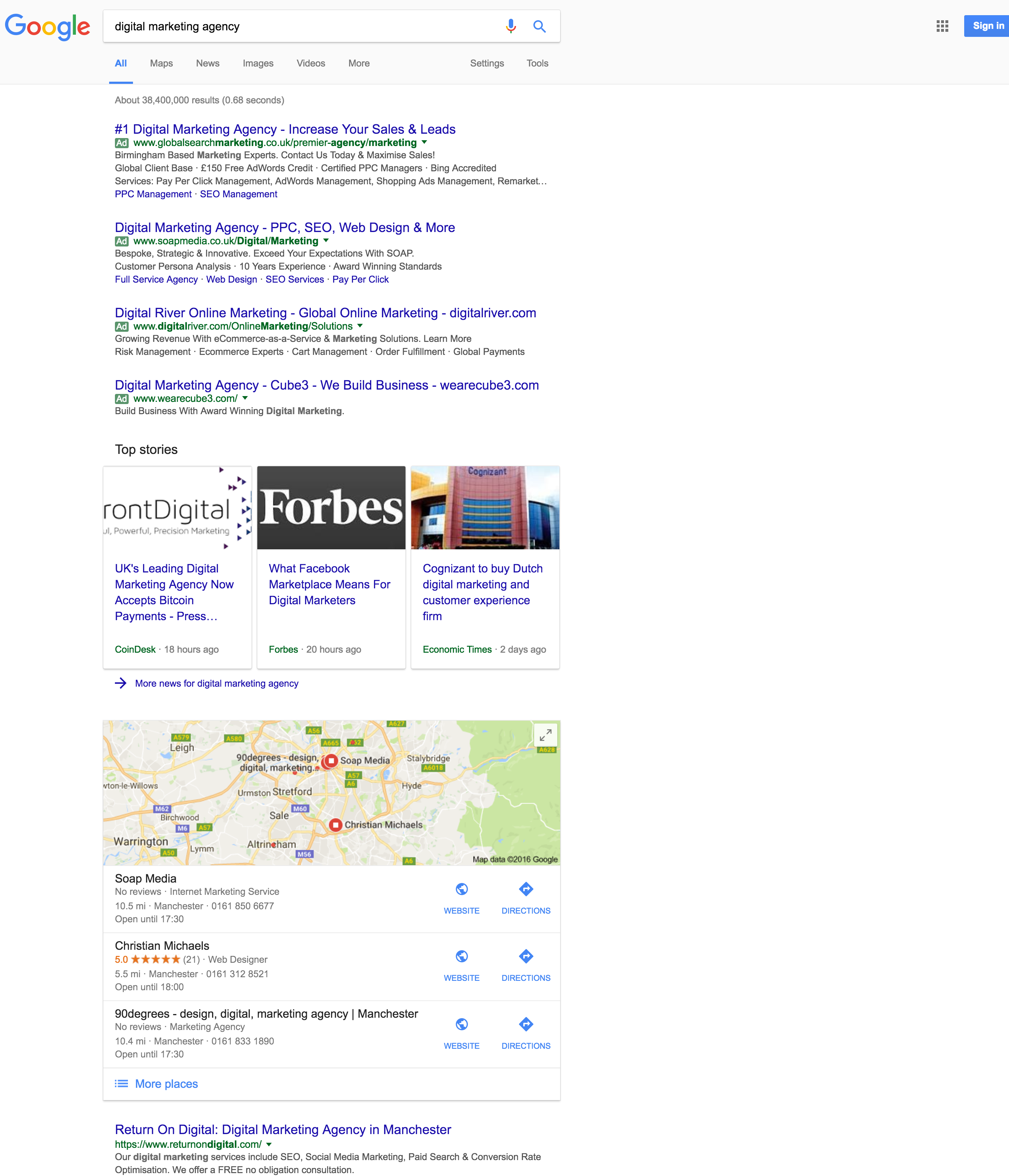
Here is a screenshot that shows the full compliment of four AdWords ads at the top of the search results, followed by card style news, then the local 3-pack. Then, after all that, the first organic listing.

Not only does it push the local 3-pack really far down, the first organic result is even further down the page. Usually, local packs are displayed much more prominently. They tend to be displayed either immediately after the AdWords ads, or sometimes after one organic result.
Normally, the news results take up a much smaller footprint than the new card styles do, so even if they had been above the local pack, it would not have been so obvious. Google is currently testing two versions of cards for news, one with images and one without images.
Thank you to Andrew Akesson for sending screenshots.