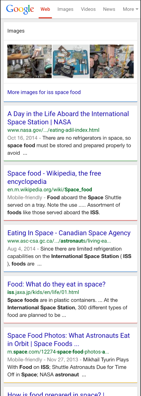
Whether or not you’ve been a fan of the Google colored line breaks that Google recently began testing in their mobile search results, Google seems to have made change where it is now the default display.
The change to the search results in first began to show up for some users last month using the Chrome browser on mobile devices.
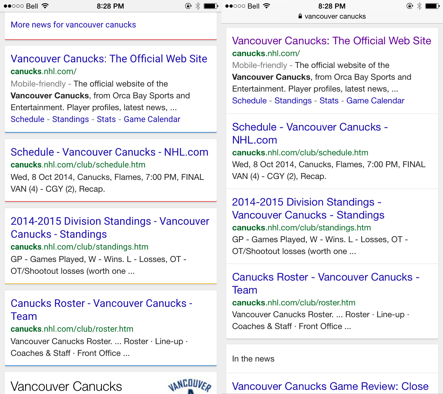
The change has a mixed reaction – particularly from SEOs – as it effectively pushed down search results that would be displayed on the screen as the added more white space and definition between each individual search result. It did make the higher search results appearing on the screen as “above the fold” seem to pop more. Here is the comparison between new and old styles, which really shows how much more screen real estate the new colored line style uses.
This change also stresses the importance of ensuring your website does appear on that first and initial screen for mobile search results, since they are so eye-catching. That of course brings up the fact that webmasters should ensure that their websites are mobile friendly before April 21, otherwise they could either search results pushed down even further.
Whether or not you like this change, it appears that Google is happy with the results in the initial testing and that it must’ve been a positive change for user experience – even if not necessarily for SEOs who might not rank #1.

