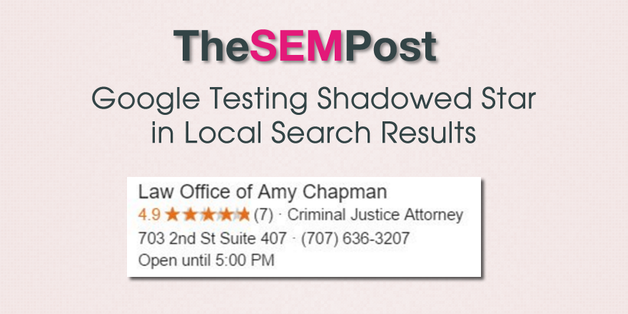
 Google is testing a new shadowed star in their search results, this one keeping the usual yellow/orange color but adding a somewhat distracting shadow behind it.
Brian Barwig spotted the test on Friday. This is how it looks:

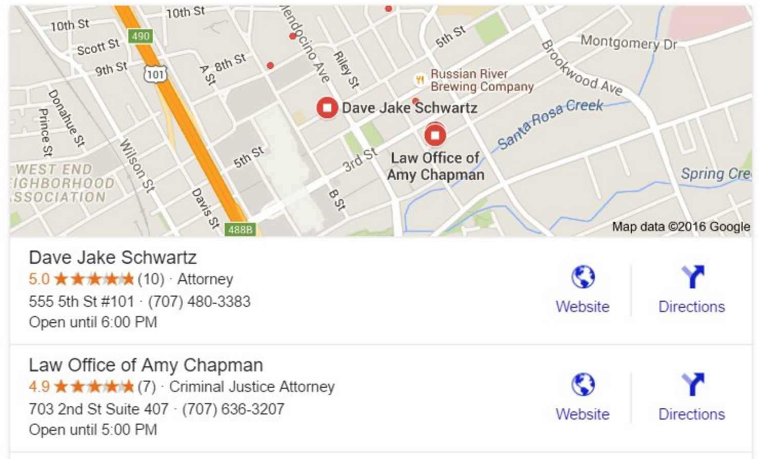
Even the placement of the shadows is a bit odd. While a drop shadow might look okay, in this test, the shadow projects further to the left depending on how many stars the listing has.
It is unclear if this test is only for local results, or if this new style of shadowed stars would also show up in things like product reviews or recipes in the search results.
It seems to be a limited test. I wasn’t able to replicate it and I haven’t heard from anyone else who also saw it. I hope this one doesn’t expand further because it is a very distracting look to the search results.
Jennifer Slegg
Latest posts by Jennifer Slegg (see all)
- 2022 Update for Google Quality Rater Guidelines – Big YMYL Updates - August 1, 2022
- Google Quality Rater Guidelines: The Low Quality 2021 Update - October 19, 2021
- Rethinking Affiliate Sites With Google’s Product Review Update - April 23, 2021
- New Google Quality Rater Guidelines, Update Adds Emphasis on Needs Met - October 16, 2020
- Google Updates Experiment Statistics for Quality Raters - October 6, 2020
Brian Barwig says
Hi Jen,
Thanks for the mention. I saw the shadowed results once on Friday and took a screen grab because it was interesting and awful. I tried several other times on Friday and over the weekend to replicate the results to no avail.
This review result appears to be much like the elusive Yeti. No one would have believed me had I not captured it 😉 Thats digital marketing for you at this point, especially with G.
Joe says
This goes completely against any form of material design, so it would be a strange move.
Ralf says
Maybe it is just a defective graphics card… or Google trying to fool SEOs. (I can hear them laughing about the fact that we are discussing shadowed stars)…..
There is no sense in shadowing a star this way.
Joy Hawkins says
I hope this isn’t a test – I think it looks terrible 🙂