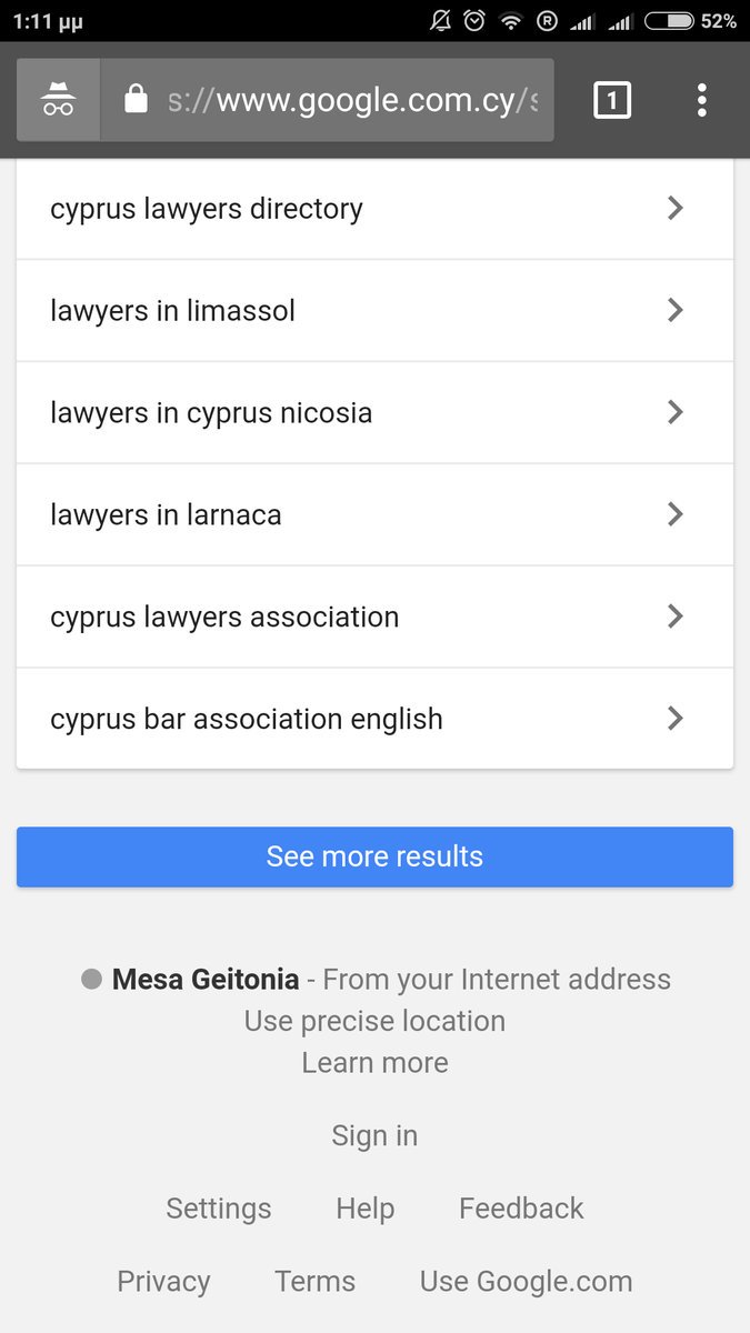
 Google has a new mobile test which is taking a cue from infinite scroll design by adding a “see more results” button at the end of the search results, instead of the usual “next” button. And in addition, Google has reduced the number of results on the page dramatically, reducing it to 4 results from the usual 10.
Nikos Aggelidakis shared the screenshot on Twitter.
Here is what it looks like:

There were also ads that appeared an addition to the 4 organic results. Additional results were loaded using the same URL, seemingly added to the bottom of the results.
Google dropping to only 4 results on a page is a pretty significant change, as it severely limits the possibility that someone would click the “see more results” button to see the results that normally would have been displayed on the same page. However, because Google includes many related searches at the bottom to help a searcher be more precise with their mobile search query, it could have the effect that the searcher is actually able to end up on a better targeted page faster, when the query is narrowed down from a more generic one.
I am not able to replicate it, so it seems to be a limited test.