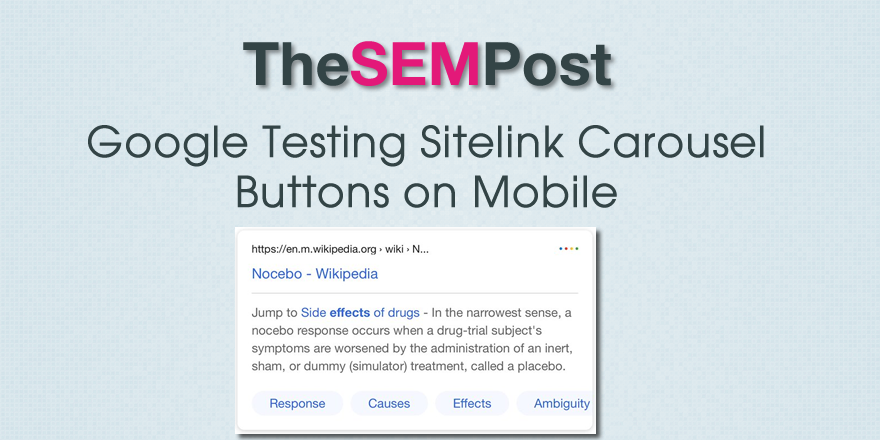
 Google has been testing multiple variations of a less colorful and more black mobile UI this year. This test includes an interesting feature – adding bubble style buttons in place of the usual sitelinks links at the bottom of some search results.
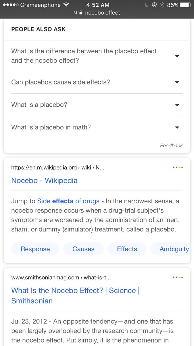
Here is the screenshot of the test, shared by Faisal Ahmed on Twitter.

The sitelinks themselves are done in a carousel style as well, meaning Google could include even more sitelinks in the carousel.
It does make the sitelinks more noticeable than the regular style, although it does take up more screen real estate. And the sitelinks would be much easier to click as well. In this case, the sitelinks are jump links that take the mobile user to specific parts on the page, something that is particularly useful for mobile users.
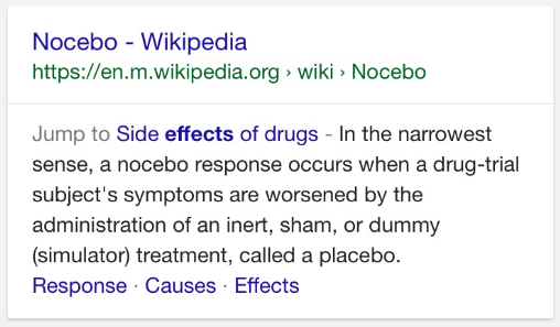
Here is the same search on mobile, showing those bubbles as regular sitelinks that Google uses in both mobile and desktop.

This is part of their limited UI testing on mobile, and I wasn’t able to replicate it.