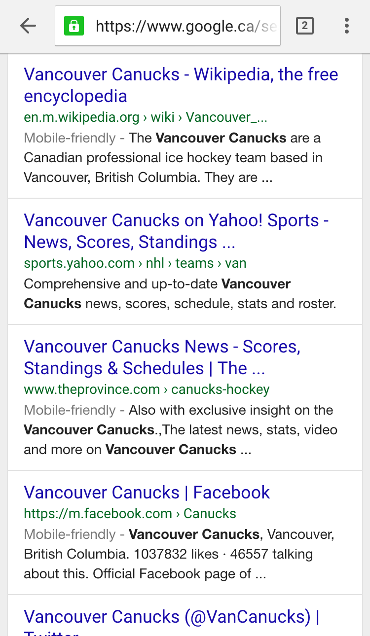
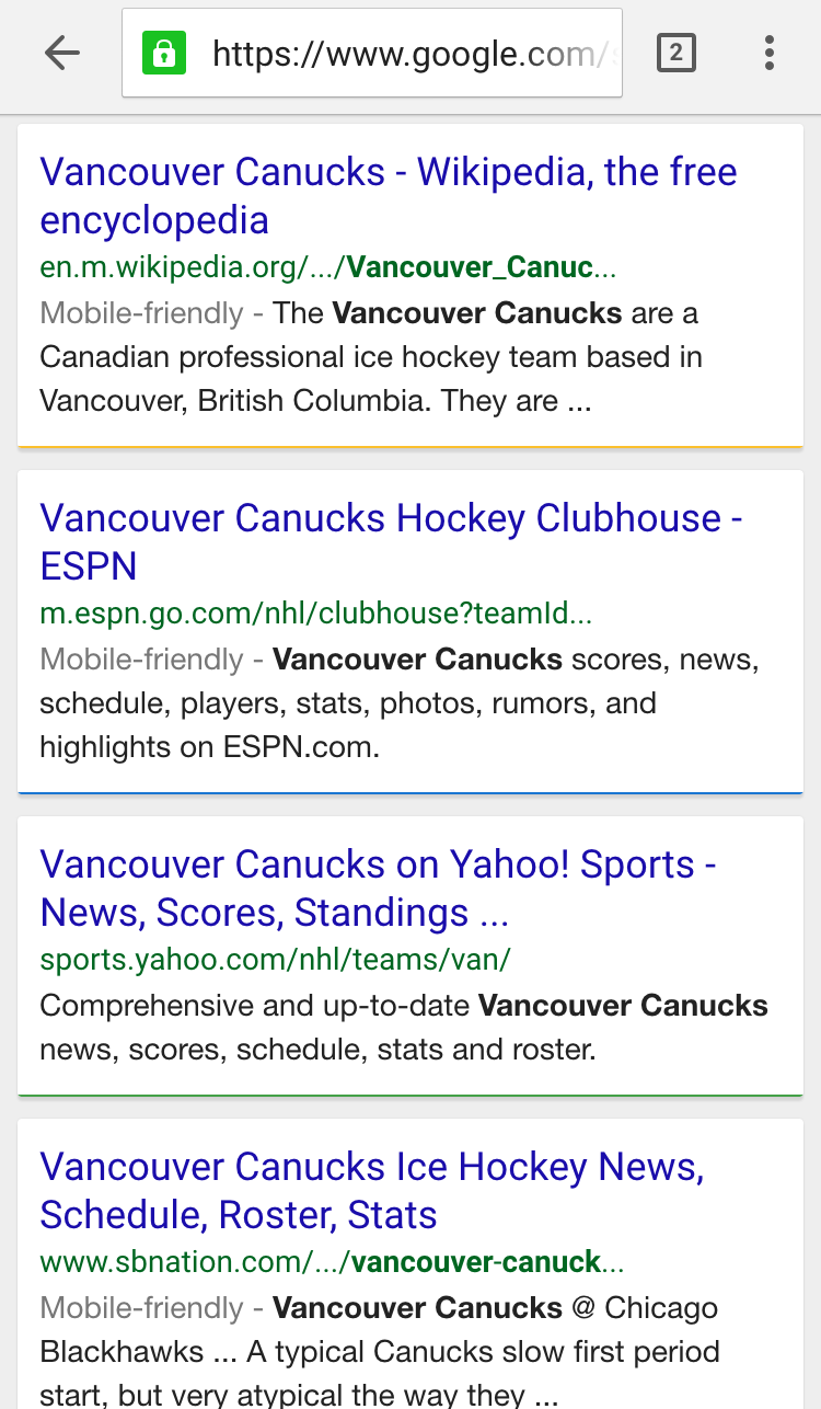
Google is testing a brand new URL structure and style in their displayed URL in the mobile Google Search results. Gone are all the /…/ for truncated URLs. Instead, Google is serving up the category names as the URL structure goes deeper, with > between each.
The resulting look is a much cleaner search results page, and the category/directory listings have the added bonus of giving additional context clues to the searcher to know if each of the search results is a good one.
Here is how they are now appearing.
The UI for these search results with > is much cleaner than the search results utilizing the old /../ style.
Here is how it regularly appears in mobile search results:
I am only seeing it being tested currently on Google.ca while Google.com shows the old URL structure with /../ in longer URLs.
Barry Schwartz stated this has been tested previously, but I thought it worth highlighting again as we near the April 21st deadline for the new mobile ranking signal to come into effect on the mobile search results, so Google could definitely be taking a closer look lately at how the search results are presented to mobile users.
Hat tip to Ross Hammond.
Jennifer Slegg
Latest posts by Jennifer Slegg (see all)
- 2022 Update for Google Quality Rater Guidelines – Big YMYL Updates - August 1, 2022
- Google Quality Rater Guidelines: The Low Quality 2021 Update - October 19, 2021
- Rethinking Affiliate Sites With Google’s Product Review Update - April 23, 2021
- New Google Quality Rater Guidelines, Update Adds Emphasis on Needs Met - October 16, 2020
- Google Updates Experiment Statistics for Quality Raters - October 6, 2020

