 When doing credit card related searches, we have all seen the credit card comparison ad unit, which is a variation of a Google Product Listing Ad, but which leads to the Google Compare Credit Card page. Now they are testing a new version which highlights the different features of various cards.
Here is how the new style looks:

This seems to be a limited test, as this new style only showed up once using both the same keywords and other variations of it. Here is how it normally appears, with the same search query as the one showing the new style:
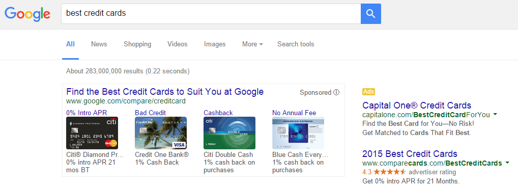 The new style they are testing looks far less cluttered than the one they usually display. But it does take up much more real estate on the screen when it is displayed, pushing the organic results down further. However, when the new style was displayed, Google doesn’t seem to also show AdWords ads. But when showing the old style, Google would display up to two additional AdWords ads either above or below the comparison ad unit. So it seems the new style means only regular AdWords ads are shown in the right hand side.
Credit card comparison ad units are currently only displayed for US searches, with the new style showing for a very small percent of searches.
H/T to Dr. Pete Meyers from Moz for spotting the test.
[…] Google Testing New Style of Credit Card Comparison Ad Unit, thesempost.com […]