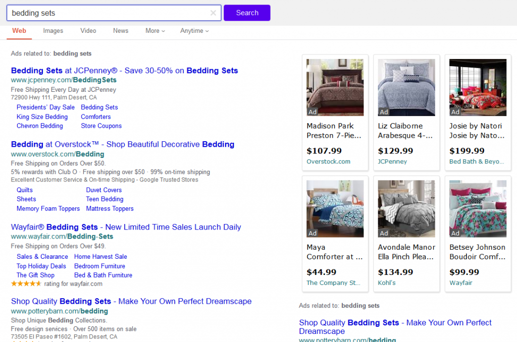
Here is how Google is displaying the product listing ads that are being shown on the Yahoo search results.

They have a very distinctive shaded border around each individual product listing. They lack the added features from Google’s own listings, such as the tags showing stock or sale notifications.
Here is how it appears on the search results page on Yahoo.

Here is another screenshot showing the same distinctive styling of Google’s PLAs in Yahoo.
And here is how PLAs normally display on Yahoo through Yahoo Shopping.
The Google version by comparison is much better looking and eye catching.
It is interesting that Google is only testing this style on Yahoo, I couldn’t find it on Google. And likewise, Yahoo is only running this new style of PLA on the Google PLA listings it is bringing into the search results, they are not testing the same style on their own listings through Yahoo.
Personally, I really like the new look. However, sometimes the end result isn’t quite working as intended, as a result of other elements on the page pushing the PLAs further right than intended, such as this:
This is a limited test, as Yahoo is only using Google’s results on an unspecified percentage of the search results (but under 50%). I got it to show in a few different browser sessions over the past few days. But Yahoo is definitely showing Bing/Yahoo well over 50% of the time though.
Jennifer Slegg
Latest posts by Jennifer Slegg (see all)
- 2022 Update for Google Quality Rater Guidelines – Big YMYL Updates - August 1, 2022
- Google Quality Rater Guidelines: The Low Quality 2021 Update - October 19, 2021
- Rethinking Affiliate Sites With Google’s Product Review Update - April 23, 2021
- New Google Quality Rater Guidelines, Update Adds Emphasis on Needs Met - October 16, 2020
- Google Updates Experiment Statistics for Quality Raters - October 6, 2020