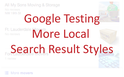
Andrew Shotland from Local SEO Guide was the first to spot the new style.
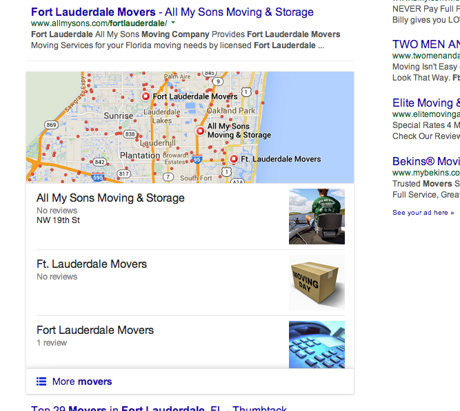
Here is the initial screenshot of the search results.
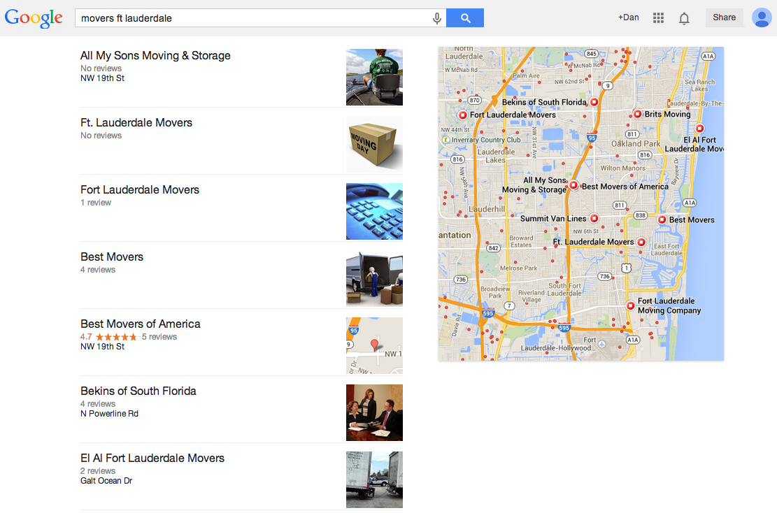
Then if you click through on the “More movers” link (something Shotland noted has been mostly absent post-Pigeon), you get an expanded results page, again with the same mobile-esque look.
And finally, when you click one of the results in that mobile-esque unit, it results in another search result page, this time as a Google search for the company name and geo-location from the originating search.
He also has reservations about how the results look within the results. “Unfortunately the design looks half-baked, the data looks super spammy and IMO it hurts the user and potentially local businesses more than it helps,” Shotland says. “I have no doubt Google will improve this experience over time, but at the moment Pigeon feels like Google taking ten steps backwards so it can move some indeterminate number of steps ahead.”
We have been seeing quite a few local search tests lately, such as this Google AdWords extension and the significant local Pigeon update several weeks ago. This one also seems to be a limited test at this time.
Jennifer Slegg
Latest posts by Jennifer Slegg (see all)
- 2022 Update for Google Quality Rater Guidelines – Big YMYL Updates - August 1, 2022
- Google Quality Rater Guidelines: The Low Quality 2021 Update - October 19, 2021
- Rethinking Affiliate Sites With Google’s Product Review Update - April 23, 2021
- New Google Quality Rater Guidelines, Update Adds Emphasis on Needs Met - October 16, 2020
- Google Updates Experiment Statistics for Quality Raters - October 6, 2020

