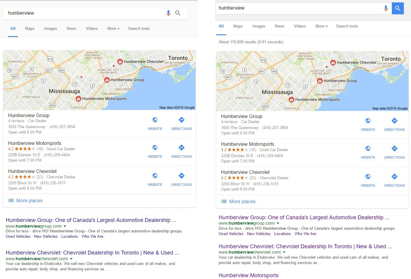
 Google is testing yet another version of their mobile, this one affecting the layout most predominantly.
What is notable about this test is it also drops the total number of search results from the page. We have seen this test with the card style UI Google has recently been testing (where each result appears within a mobile style card), but not with any of the other UI tests Google has been running recently. The loss of this information – even simply for site:example.com queries that many webmasters use daily – would definitely impact SEOs.
Here is how it looks at the top, note the different search icon and tabs spacing.

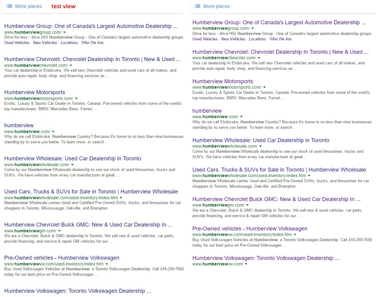
Here is the view of the bottom of the page, where the increased spacing between the individual results becomes more evident.

While the test gives a much cleaner look with more white space, it also means that results get pushed down further on the page, which isn’t good news for those that rank towards the bottom of the page.
Google has done multiple tests with added white space in the search results previously.
Thank you to Sergey Alakov for the screenshots of the test.
Jennifer Slegg
Latest posts by Jennifer Slegg (see all)
- 2022 Update for Google Quality Rater Guidelines – Big YMYL Updates - August 1, 2022
- Google Quality Rater Guidelines: The Low Quality 2021 Update - October 19, 2021
- Rethinking Affiliate Sites With Google’s Product Review Update - April 23, 2021
- New Google Quality Rater Guidelines, Update Adds Emphasis on Needs Met - October 16, 2020
- Google Updates Experiment Statistics for Quality Raters - October 6, 2020