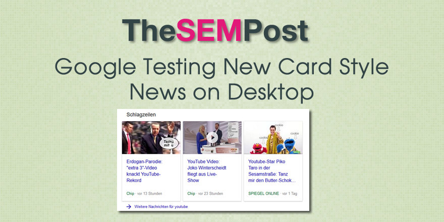
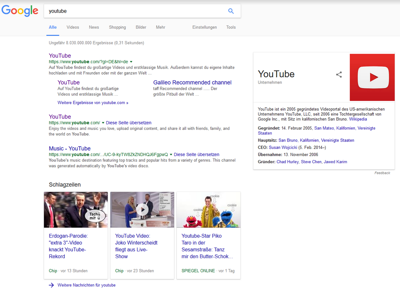
 Google is testing a new card style of news results in the regular Google search results on desktop. These cards are somewhat similar to what you see on mobile, except that they are not a carousel.
Here is what it looks like:

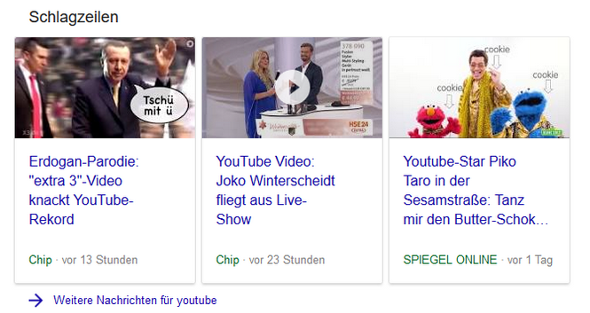
The title above the news card results translates to “headlines”, as in news headlines. Here is a closer look at it:

This test isn’t really surprising, as Google is constantly testing ways to slowly make the desktop search experience mimic the one searchers get on mobile. What is noticeable is that this isn’t a carousel, which doesn’t match the mobile experience. It doesn’t make sense that they would use this style on mobile without the carousel, unless there were only 3 results – but for this query, there would be a lot more news results, and there is the link to continue through to more news results for the query.
Thank you to Frank Sandtmann for sending the screenshots to The SEM Post.