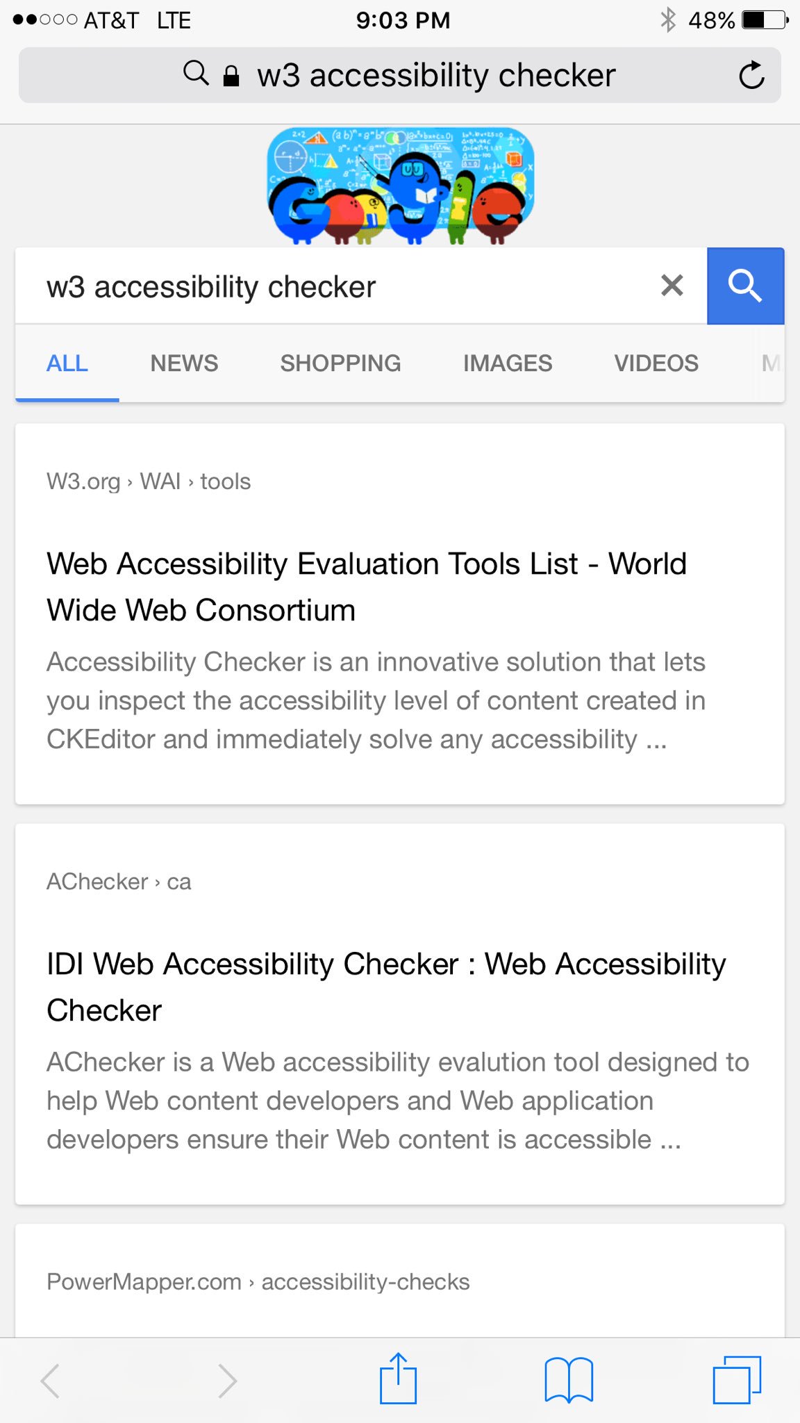
 Google doesn’t run nearly as many of their color UI tests on mobile as they do desktop. But they are currently running a black UI version of their mobile search results for some users.
Felicia Crawford spotted the changed UI on mobile. The search results look normal, except Google has dropped the usual blue and green for titles and URL breadcrumbs and replaced it with black.

A year ago, Google tested a similar black UI version of the search results for desktop users.
The following two tabs change content below.
Jennifer Slegg
Founder & Editor at The SEM Post
Jennifer Slegg is a longtime speaker and expert in search engine marketing, working in the industry for almost 20 years. When she isn't sitting at her desk writing and working, she can be found grabbing a latte at her local Starbucks or planning her next trip to Disneyland. She regularly speaks at Pubcon, SMX, State of Search, Brighton SEO and more, and has been presenting at conferences for over a decade.
Latest posts by Jennifer Slegg (see all)
- 2022 Update for Google Quality Rater Guidelines – Big YMYL Updates - August 1, 2022
- Google Quality Rater Guidelines: The Low Quality 2021 Update - October 19, 2021
- Rethinking Affiliate Sites With Google’s Product Review Update - April 23, 2021
- New Google Quality Rater Guidelines, Update Adds Emphasis on Needs Met - October 16, 2020
- Google Updates Experiment Statistics for Quality Raters - October 6, 2020