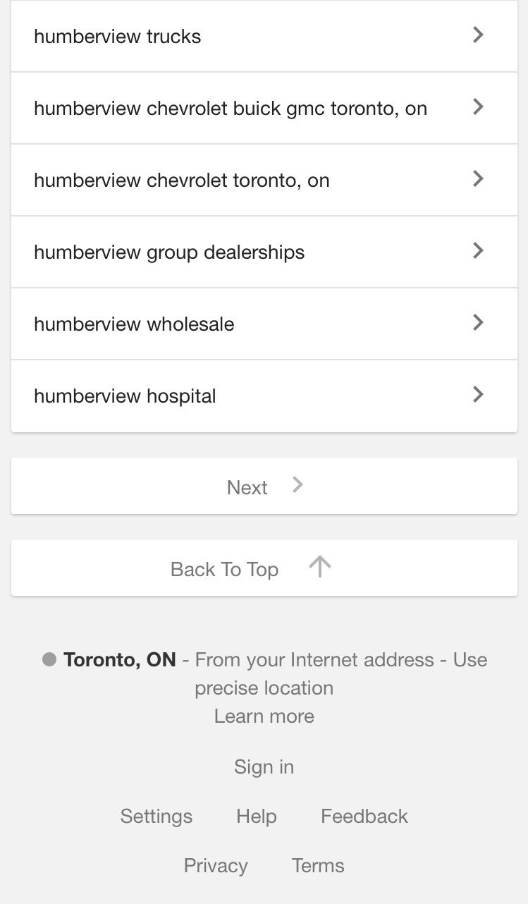
Here is how it looks:

Google was earlier testing a version that would add a blue overlay on top of the search results, that would show up when someone started scrolling further down the mobile search results. This earlier version was much more noticeable and I could see it getting a higher CTR for people wanting to jump back to the top of the search results.
By contrast, this new one is not very noticeable at all, especially since it is placed below the “next” button at the bottom of the search results.
This seems to be a limited test as I was unable to replicate it.
H/T to Sergey Alakov
Jennifer Slegg
Latest posts by Jennifer Slegg (see all)
- 2022 Update for Google Quality Rater Guidelines – Big YMYL Updates - August 1, 2022
- Google Quality Rater Guidelines: The Low Quality 2021 Update - October 19, 2021
- Rethinking Affiliate Sites With Google’s Product Review Update - April 23, 2021
- New Google Quality Rater Guidelines, Update Adds Emphasis on Needs Met - October 16, 2020
- Google Updates Experiment Statistics for Quality Raters - October 6, 2020