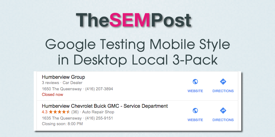
Sergey Alakov spotted this test in the search results (via incognito)

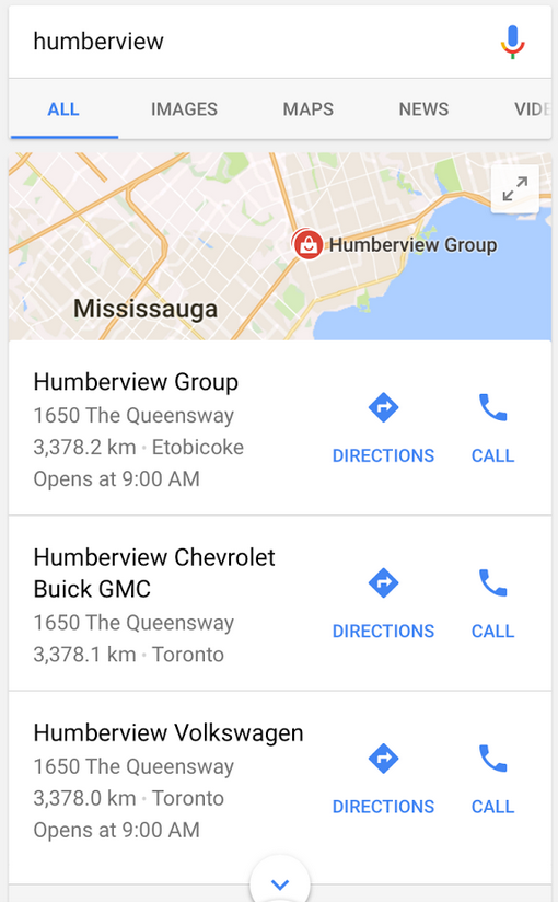
The blue color and the style of icons all match the style from the mobile results. Here is the same query on mobile:

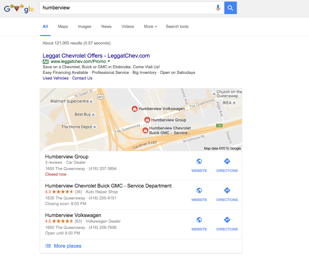
Here is how it normally appears in the desktop search results in the local 3-pack:
This test isn’t that surprising. We have seen many, many times where Google is moving the desktop search results to more closely match how they are displayed on mobile. And this makes sense, since mobile is now the dominant way that people are searching.
The mobile icons are much cleaner in the search results as well.
I tried to replicate it, but was unable. But I would expect that we could see this change coming to the desktop results for everyone, as they match desktop and mobile.
Jennifer Slegg
Latest posts by Jennifer Slegg (see all)
- 2022 Update for Google Quality Rater Guidelines – Big YMYL Updates - August 1, 2022
- Google Quality Rater Guidelines: The Low Quality 2021 Update - October 19, 2021
- Rethinking Affiliate Sites With Google’s Product Review Update - April 23, 2021
- New Google Quality Rater Guidelines, Update Adds Emphasis on Needs Met - October 16, 2020
- Google Updates Experiment Statistics for Quality Raters - October 6, 2020