 Google has been making their desktop search results much more like mobile search results in recent years, and their latest test brings that to a whole new level. Google is testing the card style search results that many associate with the mobile search results.
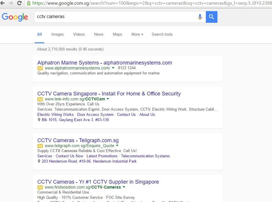
Here is how AdWords ads appear:
And here is the regular organic results.
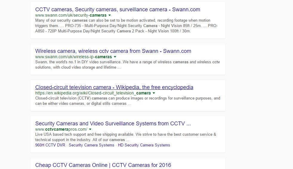
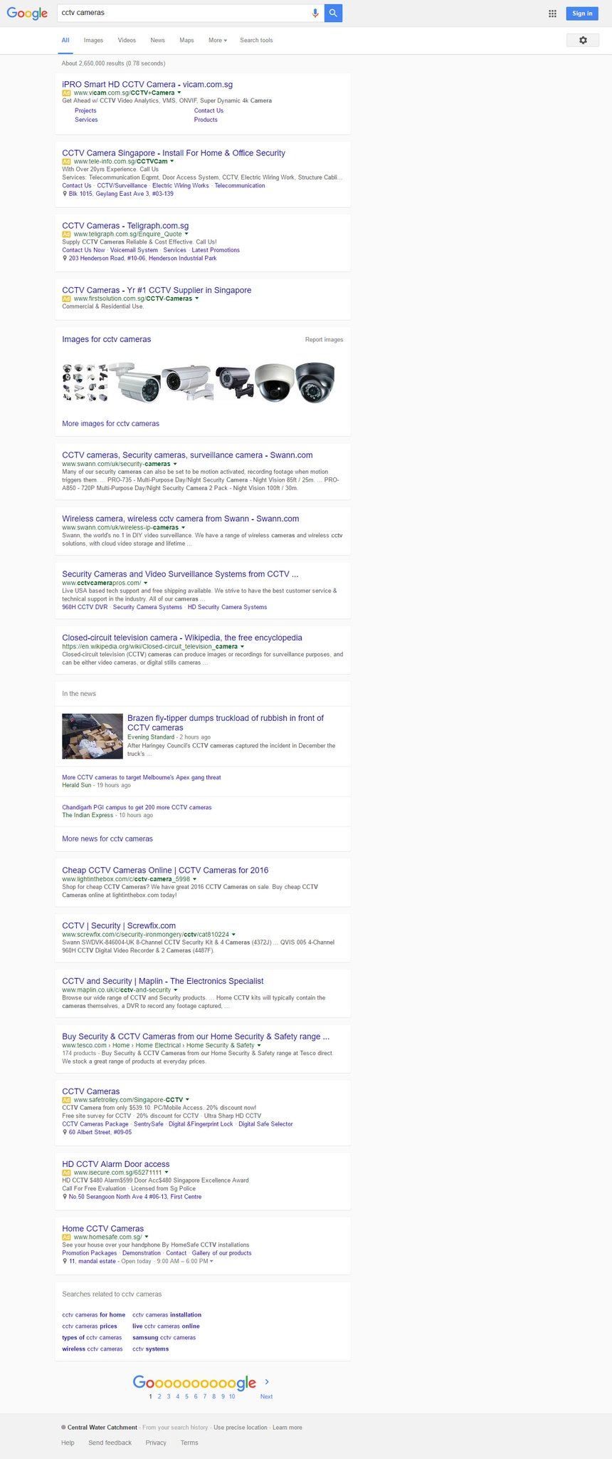
As you can see this takes up significant white space in the search results, meaning searches with 4 AdWords ads at the top will command a huge amount of screen real estate. The same for the organic results, the top organic results will fair significantly better than those lower on the screens simply because of how much more scrolling is required to view the entire page of search results.
Kiran Nagula was the first person to spot this test. The search was done on Google.com.sg.
Search features, including “in the news” and image results were also served in this same card style.
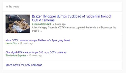
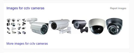
In the news results don’t seem to include AMP results however, even though this page is in the mobile card style.
This does seem to be a limited test as I was unable to replicate the results. I haven’t seen others reporting this test, but it could be something rolling out to more users currently.
The implications if Google was to switch to this search style would be pretty significant. AdWords advertisers would be pretty happy, especially those in the top 2 positions, since the extra added whitespace between the results and the padding itself would mean those top ads would be showcased much more than they are in the current version of the desktop results. Likewise, this would likely put organic results below the fold for those 4 top ad search queries, at a time when many SEOs are already concerned about the loss of on-screen space with the addition of the 4th ad Google did earlier this year at the top. But even for a test, this could negatively impact organic results.
Update: we have more examples below, but with the number of people reporting this, it could be larger than a regular 1% test that Google often does.
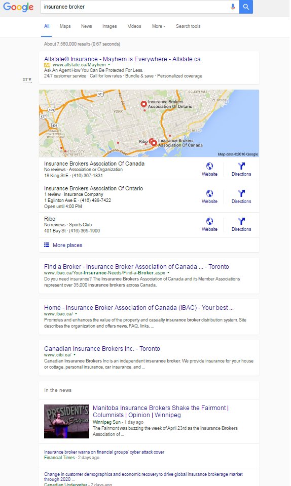
Added: Here is how the local results look like, shared by Joy Hawkins.
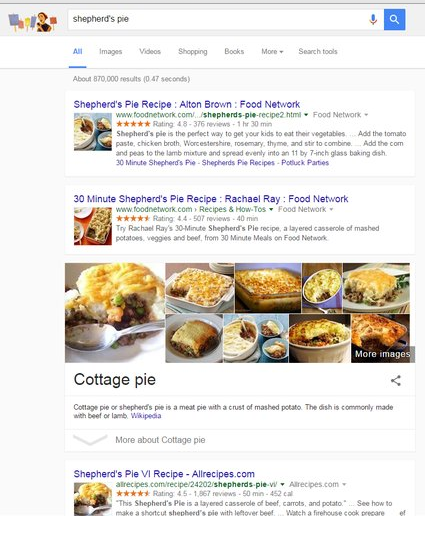
Added: And here is a version with recipes and a knowledge panel variant in the regular search column, again the same as in mobile, this one from Dr. Pete Meyers.
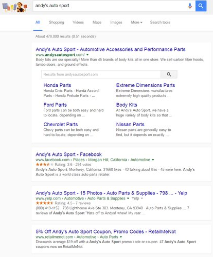
And another with sitelinks.
Here is the full screen version of the search results.
Brian Barwig says
I like this. Gives a nice, clean, simple look to the SERPs
Chris Stapleton says
This card style layout for Google results has appeared for me only on Firefox, not on Chrome. I find it so hard to read that I had switched from Firefox to Chrome. Could this be a deliberate strategy to sabotage a competing browser? That would be an enormous abuse of their search engine market dominance, prohibited under competition legislation.
Jennifer Slegg says
No, it is not targeting users on a particular browser, the first screenshot in this article shows it in a Chrome browser.