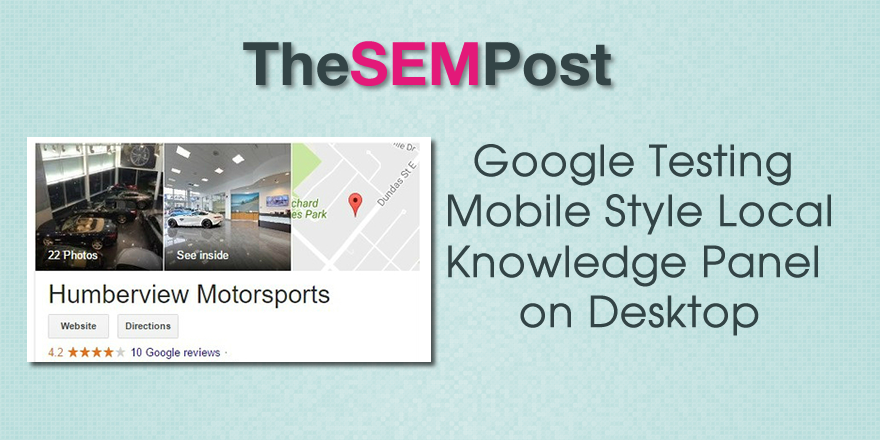
 Google is testing a new style of the local knowledge panel on desktop, which is actually the mobile version of the knowledge panel.
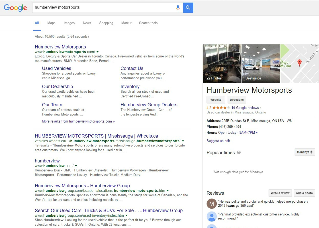
Here is how it appears, the primary difference in the photos at the top being displayed carousel style rather than the desktop style:

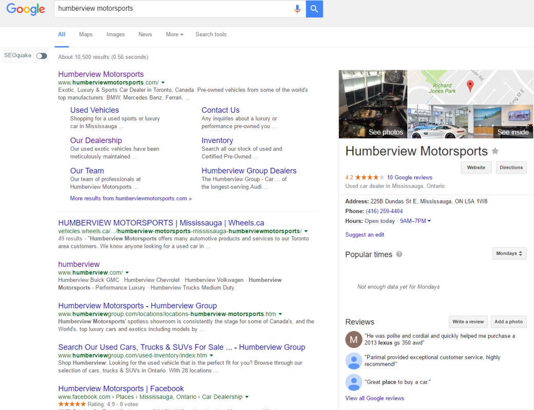
With the mobile style, it is also missing the option to favorite the business. The rest of the changes are in the styling.
Here is how it usually appears:
 This version does not display in the main search results column, as we have also seen in testing, but in the right side column.
Most will probably see this as a great change, since it gives the photos more room, since the horizontal style images are often cropped oddly to fit the space of the regular desktop version. It also includes added information about how many photos are available, rather than just stating “see photos.”
This isn’t surprising, as Google has been slowly moving various aspects of the desktop search results to match how it is displayed on mobile, so I imagine this is something we will see roll out to desktop eventually.
Thank you to Sergey Alakov for the screenshots of the test.
[…] Google Testing Mobile Local Knowledge Panel on Desktop, thesempost.com […]