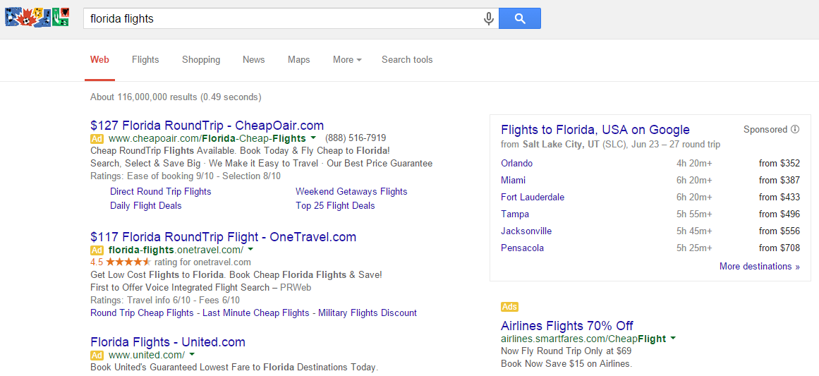
 Google often adds a sponsored flight search box into the Google search results when the search query indicates the searcher is looking for a flight. Now they are testing a different style of box, this one in the sidebar that appears directly above the sidebar AdWords ads.
Here is how it looks:
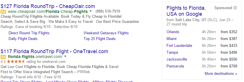
It is responsive, here is how it appears on a browser that isn’t as wide.
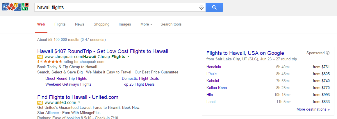
 And an example for a different search query:
It is a much more streamlined approach in comparison to the usual style of box we see in the middle of the page, usually under the main AdWords ads at the top.
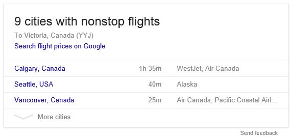 This is clearly good for those who are appearing in both the AdWords ads at the top as well as organic search results, as it is a bit less noticeable placed in the sidebar instead of in the body of the results. However, those who either lack the quality score or don’t bid high enough are definitely being pushed down in the sidebar in favor of the sponsored flight search box.
This new sidebar style of flight search sponsored box also leads to the usual Google Flight Search page.
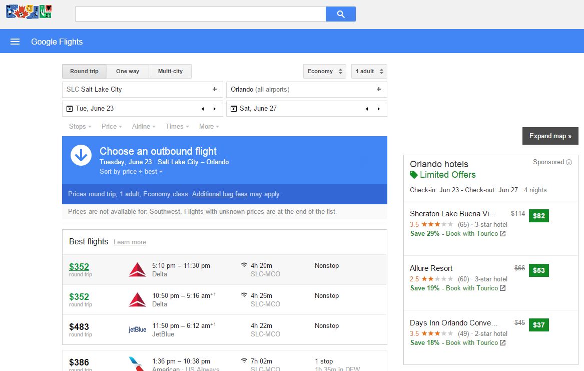 It will be interesting to see if this type of sponsored flight search box sticks around and if Google transitions the old style in the body to this new one.
