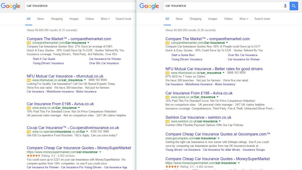
Here is how it looks in the search results, one with the extra white space and the other showing how Google normally displays the results.

Justin Aldridge from Artemis Marketing was the first to spot this test, and sent us the screenshots. He mentioned that between the two, he prefers the look of the one on the left with the added white space.
The results with the white space definitely looks less cluttered compared to the usual version we see on the right. But for those who rank in the organic search results, it definitely pushes those organic results down lower, especially since this particular query shows 4 ads, one with the full compliment of sitelinks.
I couldn’t replicate this version, so it is likely one of Google’s very limited tests.
Jennifer Slegg
Latest posts by Jennifer Slegg (see all)
- 2022 Update for Google Quality Rater Guidelines – Big YMYL Updates - August 1, 2022
- Google Quality Rater Guidelines: The Low Quality 2021 Update - October 19, 2021
- Rethinking Affiliate Sites With Google’s Product Review Update - April 23, 2021
- New Google Quality Rater Guidelines, Update Adds Emphasis on Needs Met - October 16, 2020
- Google Updates Experiment Statistics for Quality Raters - October 6, 2020


