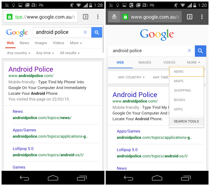
Google is testing a brand new style of mobile search results that is much cleaner and seems to take some style elements from regular desktop search.
Google has taken the Google logo and placed it above the search box
Android Police has the screenshot comparing the old style with the new, and I must say I do like the look of the new style much better.
However the one downfall to the more Google desktop look is that it does push the results further down on the screen, although normally most users do not have the search tools displayed on their search results. But this slight tweak with the results pushed down means that users probably won’t like it as much from a practical point of view.
If there are also AdWords ads added to the search results, it could also completely push organic results down below the fold.
I wasn’t able to replicate this so it is likely a small test Google is running.
Jennifer Slegg
Latest posts by Jennifer Slegg (see all)
- 2022 Update for Google Quality Rater Guidelines – Big YMYL Updates - August 1, 2022
- Google Quality Rater Guidelines: The Low Quality 2021 Update - October 19, 2021
- Rethinking Affiliate Sites With Google’s Product Review Update - April 23, 2021
- New Google Quality Rater Guidelines, Update Adds Emphasis on Needs Met - October 16, 2020
- Google Updates Experiment Statistics for Quality Raters - October 6, 2020


