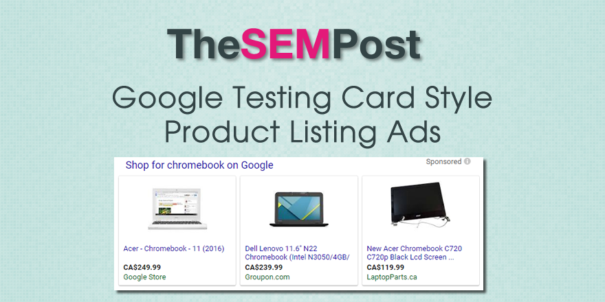
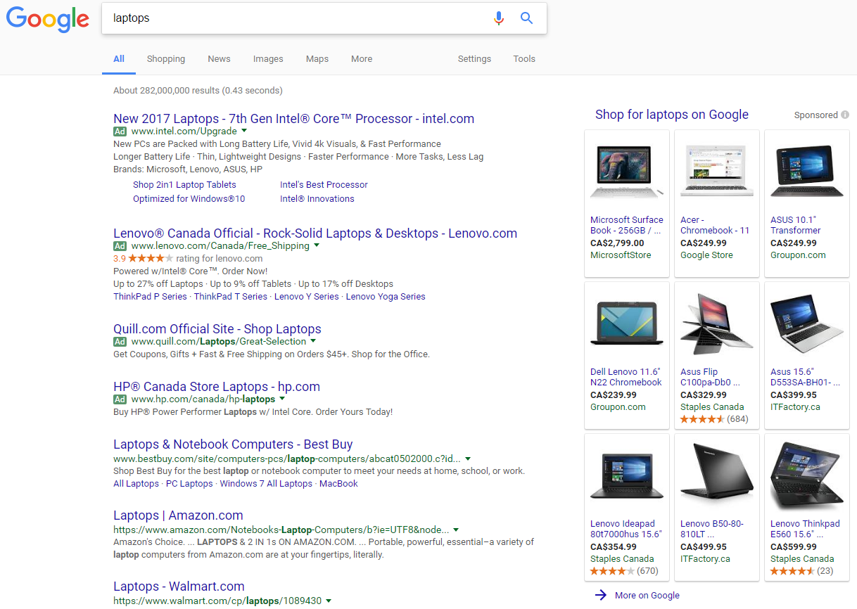
 Google is testing out the card style format on their Product Listing Ads now on desktop. This format stands out quite a bit against the regular formatted search results. Google is testing the card style PLAs at both the position at the top of the search results and the ones that appear in the right hand sidebar.
Here is what it looks like.
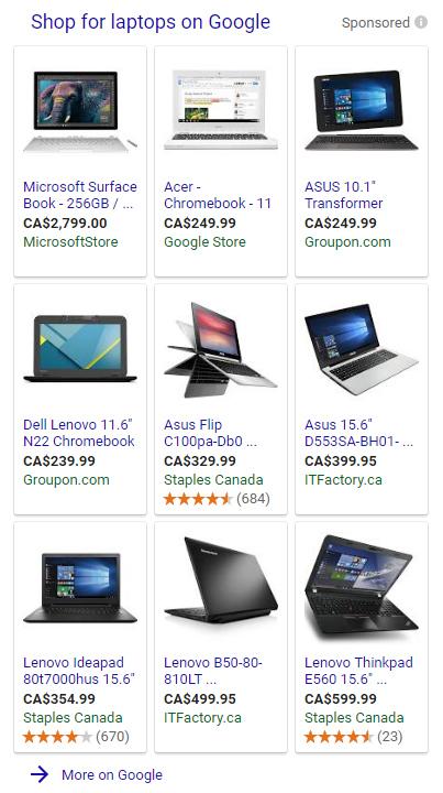
And a closer look at the PLAs:
And another example – this one looks much busier since the images are full images rather than a product on a white background like the laptop example:
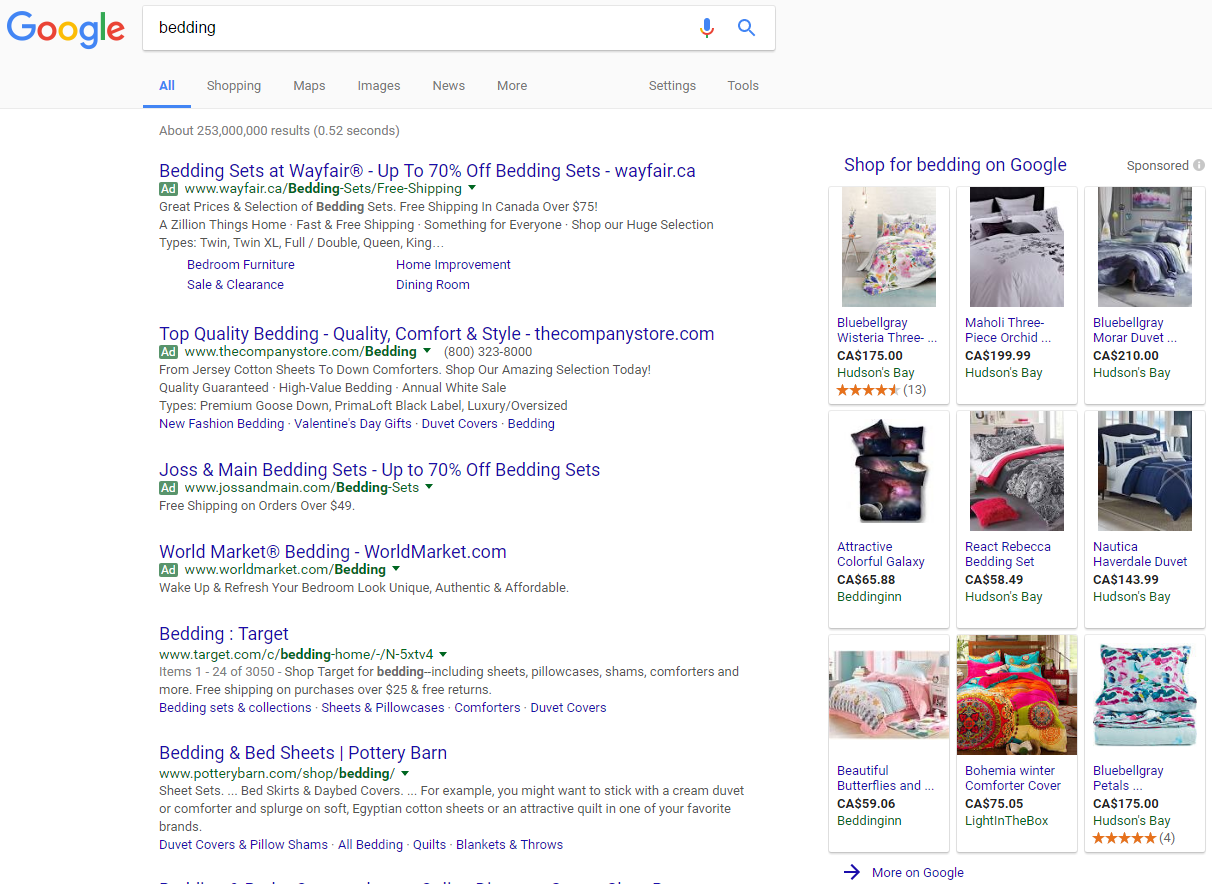
Google doesn’t always show three rows of products, they can also show only two:
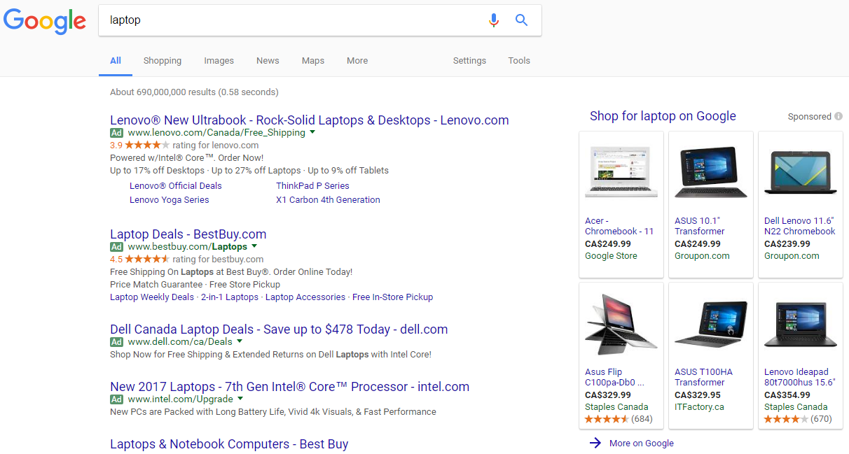
They do show fewer products in most cases, since the boxes and shading take up additional screen space, compared to the usual table format we see. But they do stand out much more for searchers. In the above screenshots, there are only three products across instead of the usual four.
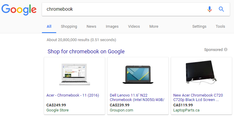
Here is how the PLAs look at the top of the search results:
And another version showing the carousel format of PLAs.
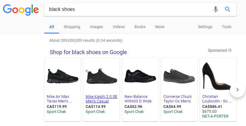
It is worth noting that these were being tested on pages that did not show the mobile card style search results on desktop. The main organic search results were formatted normally, it was only the Product Listing Ads in the card style.
Jennifer Slegg
Latest posts by Jennifer Slegg (see all)
- 2022 Update for Google Quality Rater Guidelines – Big YMYL Updates - August 1, 2022
- Google Quality Rater Guidelines: The Low Quality 2021 Update - October 19, 2021
- Rethinking Affiliate Sites With Google’s Product Review Update - April 23, 2021
- New Google Quality Rater Guidelines, Update Adds Emphasis on Needs Met - October 16, 2020
- Google Updates Experiment Statistics for Quality Raters - October 6, 2020