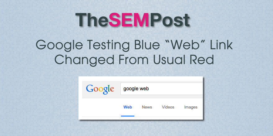
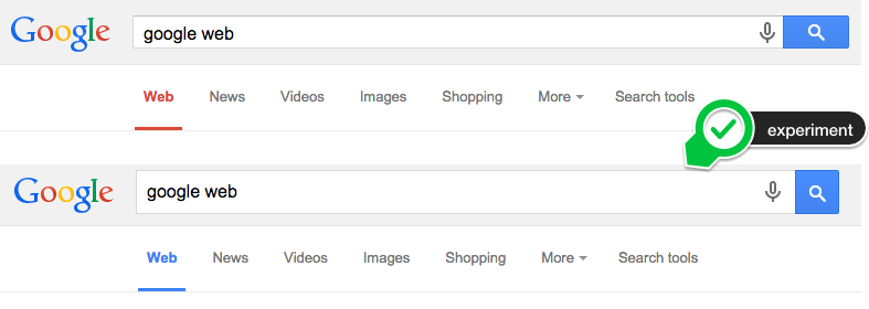
 Google is testing a pretty significant UI change for them – changing the traditional, and longstanding, red “Web” link that appears at the top of the Google search results to one in blue.
 I am actually surprised at how much I like this, as well as how noticeable it is that it changed.
From what I can recall, this is the first time Google has experimented with changing the color of the “Web” link, but it does match the Google logo better in terms of color order.
Google is also running another test that features the blue “web” link – this one the also adds capitalization in the headers and plenty of bonus line breaks.
Joost de Valk of Yoast fame was the first to spot the blue link on the desktop.
Jennifer Slegg
Latest posts by Jennifer Slegg (see all)
- 2022 Update for Google Quality Rater Guidelines – Big YMYL Updates - August 1, 2022
- Google Quality Rater Guidelines: The Low Quality 2021 Update - October 19, 2021
- Rethinking Affiliate Sites With Google’s Product Review Update - April 23, 2021
- New Google Quality Rater Guidelines, Update Adds Emphasis on Needs Met - October 16, 2020
- Google Updates Experiment Statistics for Quality Raters - October 6, 2020