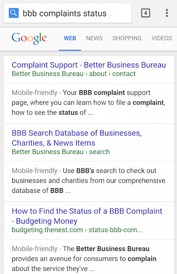
 Google is running another interesting mobile test with additional lines in between titles and descriptions.
Google OS spotted the change in mobile search results in Chrome, which also features the usual “Web” etc links at the top of the results all in capital letters as well as a new blue “web” link.
Google Mobile Search Tests More Dividing Lines http://t.co/E2Is2VeDgx pic.twitter.com/sFLAlkVo3i
— Google OS (@googleos) June 19, 2015
Personally, I find these results look very cluttered and it is a bit harder to tell which snippets go with which title. And at least they utilized the grey line breaks instead of the Google colored lines.
However, we all know Google loves to test how search results are displayed, so it will be interesting to see if this sticks around or gets more exposure.

[…] Google Testing Additional Line Breaks in Search Results – June 19, 2015 […]