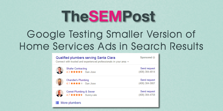
 Google has been doing lots of testing lately with their Google Home Services Ads, and they are testing one more variation to the ad unit that appears at the top of the search results. This time it is a much smaller version of the ad unit, which reduces the amount of space it takes up in the results.
Here is the new version Google is testing. It no longer has the added descriptions or selling points. It reduces the height of the ad unit quite a bit.

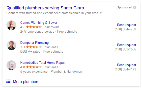
Here is how it appears normally, with the added description lines for each business.

The version they are testing is much more streamlined and doesn’t look nearly as cluttered as the regular version does. It also means that the organic results are displayed higher on the page, which is good news for SEOs.
Will this new version gain traction in the results? It is hard to say, but Google is surely monitoring the differences in CTR between the two variations.
Google has been testing out different ways of both displaying these ads as well as to promote them. The “Send request” call to action was recently added. They also began using AdWords to promote them as well.