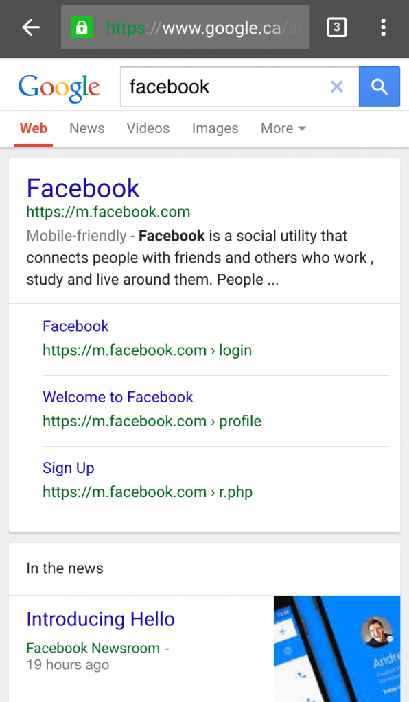
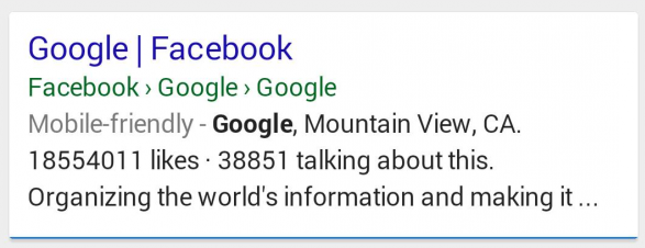
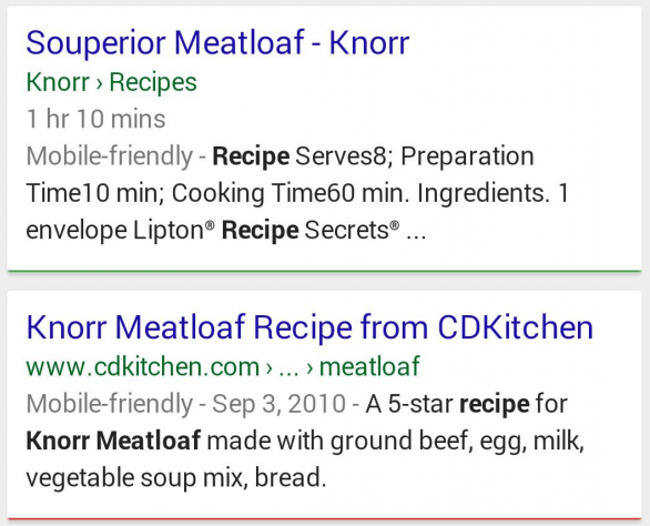
 When Google officially launched the new mobile breadcrumbs, they were running a mix of URLs and site names to show the site name of each result in the mobile search results. At the time, I said I preferred the old style structure they had been testing a few weeks earlier as it retained the example.com and https://example.com at the start of the breadcrumb.
It looks as though Google has tweaked their mobile search results in order to show whether a site is HTTPS or not.
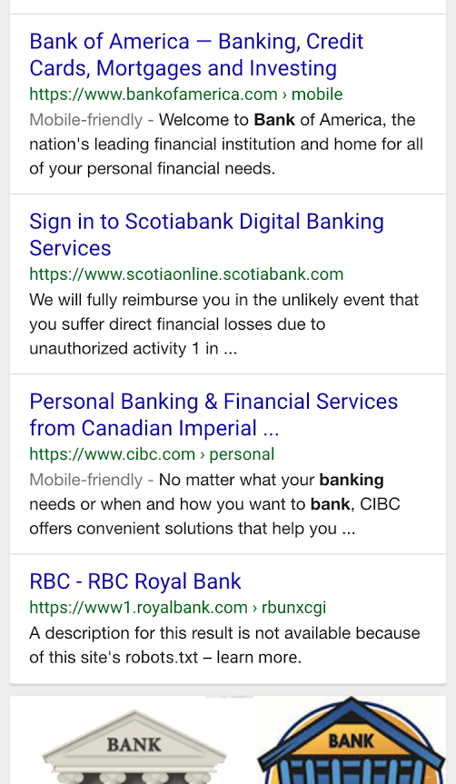 Google is also retaining the HTTPS in breadcrumbs for sitelinks as well.
Prior to this tweak, here is how Facebook was appearing after the new breadcrumbs were launched, prior to them making the HTTPS status visible.
I really like this change that Google has made here. With the focus on security and HTTPS, it makes sense that Google wants to highlight sites that are HTTPS in the search results, even when using the fancy breadcrumb structure for mobile users. They seem to have made this change late last week but sometime after they officially launched the new breadcrumbs. But they do appear to be showing by default for all search results that are HTTPS.
This also means that a site can influence if they prefer to have their URL name instead of site or company name used as part of the breadcrumb as well.
They also seemed to have changed how they display the site name as well, always showing it in the form of example.com instead of showing a mix of URL and “Site Name” format.
Here is how they showed last week at launch, with a mix of the two.
Here is how they seem to be displayed across the board for non-HTTPS URL results, showing the same search as above.
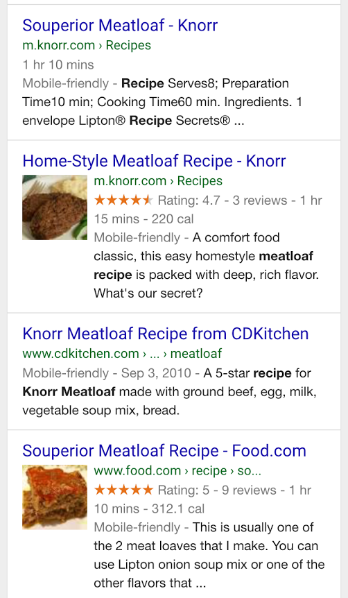 They are also highlighting subdomains as well, showing m.example.com where available.
The question had also been raised about whether they could possible be spammed or spoofed as well, which was an issue I immediately thought of once I saw them in action. But this change seems to solve that issue completely, and personally, I think this is better for usability, especially for site names that might be very similar or almost identical – such as a .com and a .net or .co.uk.
In all, great changes to tweak the appearance of breadcrumbs for mobile usability.
Update: Some people are still saying they are seeing the old style, so this just might be another test Google is running.
