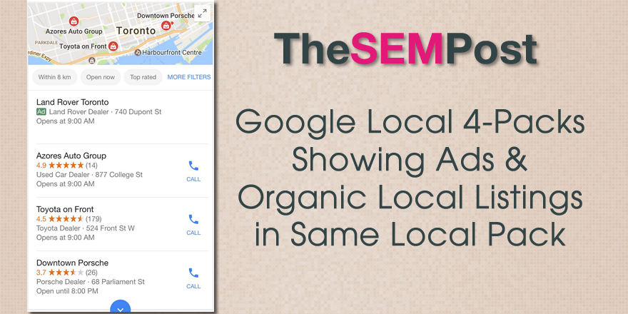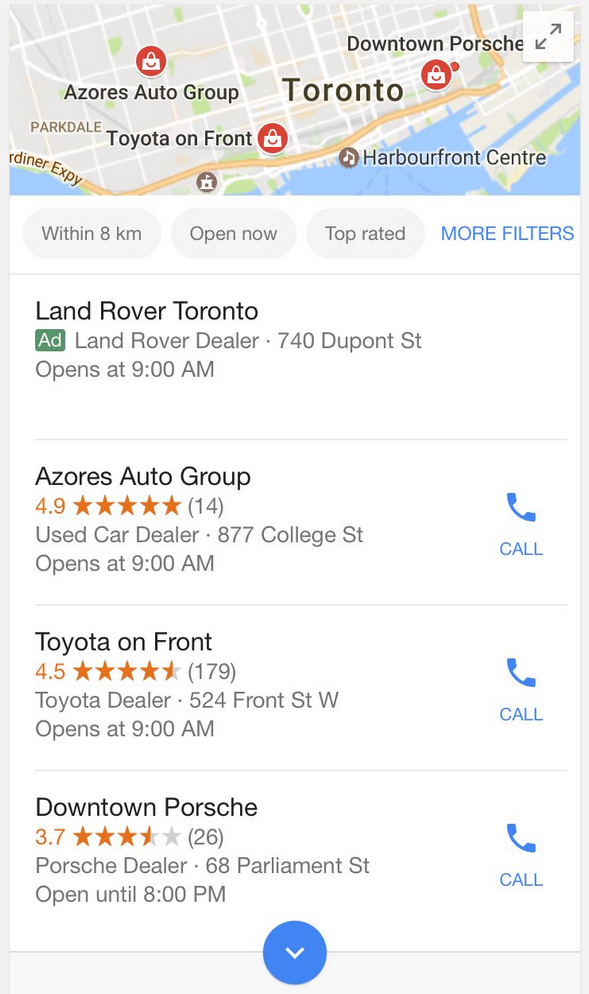
Sergey Alakov spotted this in action this morning, with one paid local listing followed by three organic ones.
Here is what it looks like:

I do like the fact they have added a single ad listing and increased the pack to 4, so that local businesses aren’t suddenly losing a position in the organic pack. The pack seems identical in other ways.
It also includes the filters we are familiar with in local listings that allows you to get more detailed with your results.
I think this style with the green “Ads” tag in front of the actual listing helps it stand out as being paid. The paid local 4-pack just had “Ads” with “Nearby businesses” above the listings.
This seems a good solution for local businesses that were seeing the local paid ad 4-pack, then regular AdWords ads, before the local non-paid organic listings would be shown. Yes, an ad is first, but this is a much optimal format compared to previous versions of ads we’ve seen where organic is pushed much further down the screen.
This seems to be mobile only and a test, as I am unable to replicate it.
Jennifer Slegg
Latest posts by Jennifer Slegg (see all)
- 2022 Update for Google Quality Rater Guidelines – Big YMYL Updates - August 1, 2022
- Google Quality Rater Guidelines: The Low Quality 2021 Update - October 19, 2021
- Rethinking Affiliate Sites With Google’s Product Review Update - April 23, 2021
- New Google Quality Rater Guidelines, Update Adds Emphasis on Needs Met - October 16, 2020
- Google Updates Experiment Statistics for Quality Raters - October 6, 2020