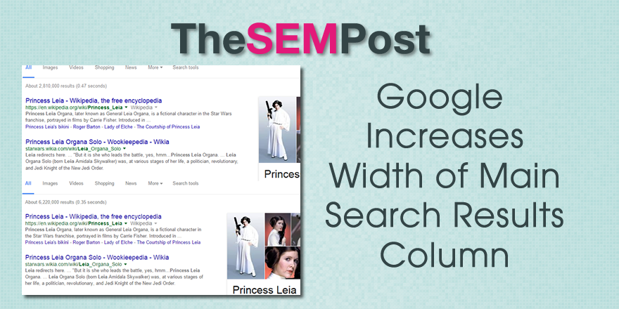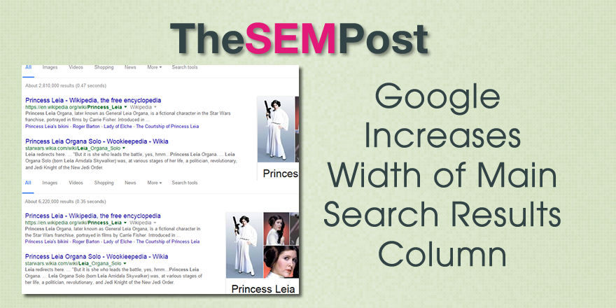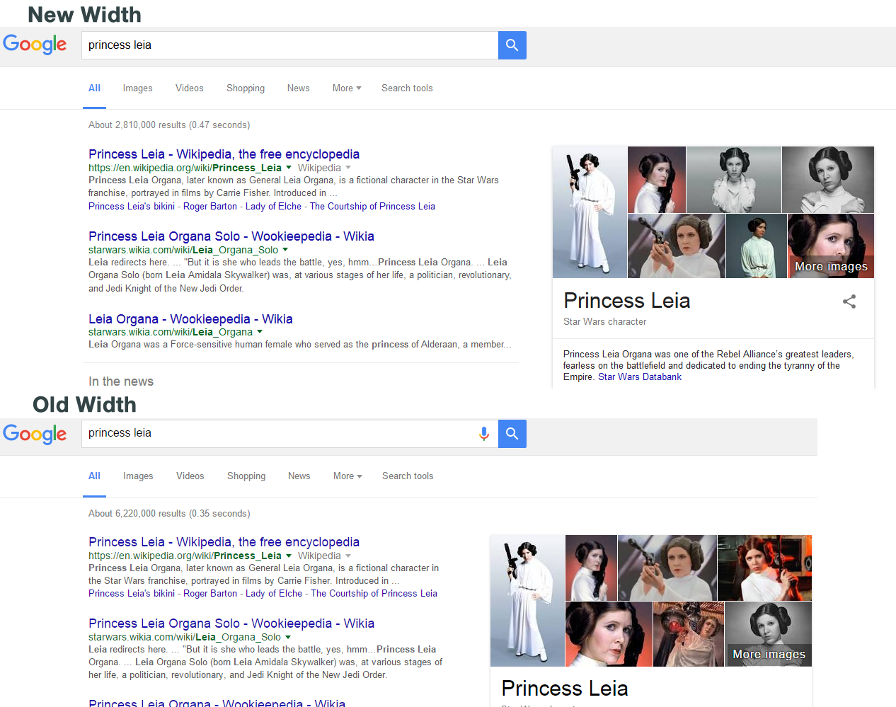
Google has increased the column for organic search results to about 600 pixels from 500 pixels. The amount of whitespace between the results and features in the right sidebar has decreased by 5 pixels, from 65 pixels to only 60.
Featured snippets, local packs and AdWords are all impacted by this new change.
First, here is a comparison side by side (click to see full size):
And here it is a bit easier to see the change in width (click to see full size):
What does this mean for organic results? With the shift in width, it could actually move search results higher on the pages, if some of the multi-line listings end up needing one less line.
Many of the features in the main search results column are reduced in height, meaning that some organic results, depending on the particular search query, could be pushed up on the page. This is great news, especially for those who were disappointed when Google changed the search results to add 4 AdWords ads at the top of the results page.
This also means there is a new title length! So instead of trying to work within 55-60 characters maximum, you now have 70 characters before Google will add the ellipses (…) Descriptions are increased by 16-20 characters. For all the specifics of the new title and description length for SEO, you can find the new title and description character lengths here.
Featured snippets are also increased, although it doesn’t appear that the amount of text within the box itself has changed. Instead, the height is reduced significantly. But the title is also increased. The width for featured snippets is now 646 pixels wide (46 pixels wider than the regular organic search results), up from 556 pixels.
Local map packs are also increased and the new packs are the same dimensions as the featured snippets. For local SEOs, there’s more info specific to the new wider 3-packs here. Here is the comparison between the two versions.
The width of features in the right hand column, such as Google’s knowledge panel, are still the same width and were not adjusted at all.
AdWords is now also showing wider AdWords ads in the search results too.
It seems as though this has gone live to many searchers in the last day or two, but may have been in testing starting a week ago. It is rolling out internationally as well, as we are seeing it on Google.co.in, Google.co.uk, Google.ca, Google.co.au and many others that we tried. And it is appearing in multiple languages too. It is clearly not a 1% test, which is the usual percentage of search results that get a Google test. [Update: At least one person is reporting they haven’t seen it roll out yet earlier today but saw it in testing.]
It is showing both signed in and incognito. For reference, showing both incognito and logged in.
Jonathan Jones was the first to spot the column width change [added: Andrea Pernici spotted it a day earlier]. I did notice that Google had changed the formatting of their Product Listing Ads at the top of the search results, which seems to be related.
I have reached out to Google and will update when I know more.
Jennifer Slegg
Latest posts by Jennifer Slegg (see all)
- 2022 Update for Google Quality Rater Guidelines – Big YMYL Updates - August 1, 2022
- Google Quality Rater Guidelines: The Low Quality 2021 Update - October 19, 2021
- Rethinking Affiliate Sites With Google’s Product Review Update - April 23, 2021
- New Google Quality Rater Guidelines, Update Adds Emphasis on Needs Met - October 16, 2020
- Google Updates Experiment Statistics for Quality Raters - October 6, 2020


