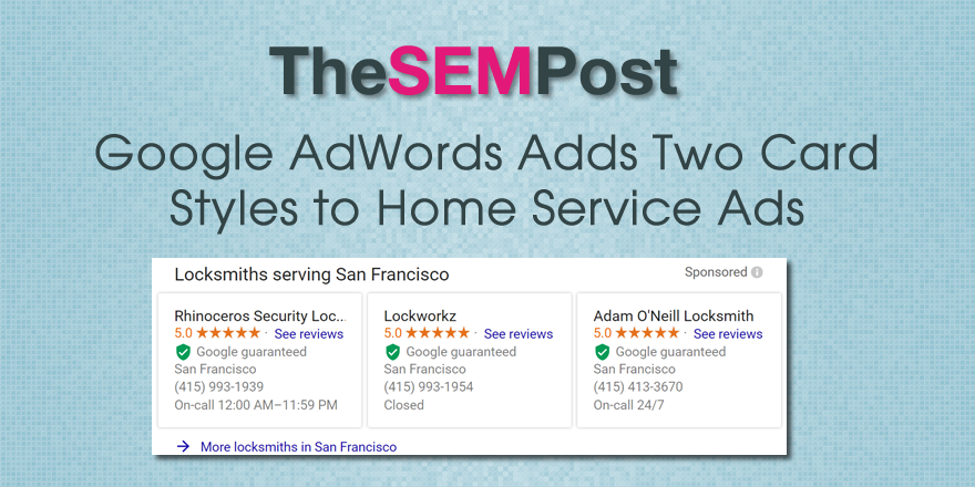
 Google is testing two different versions of the mobile card style results for their Home Services Ads in the desktop search results.
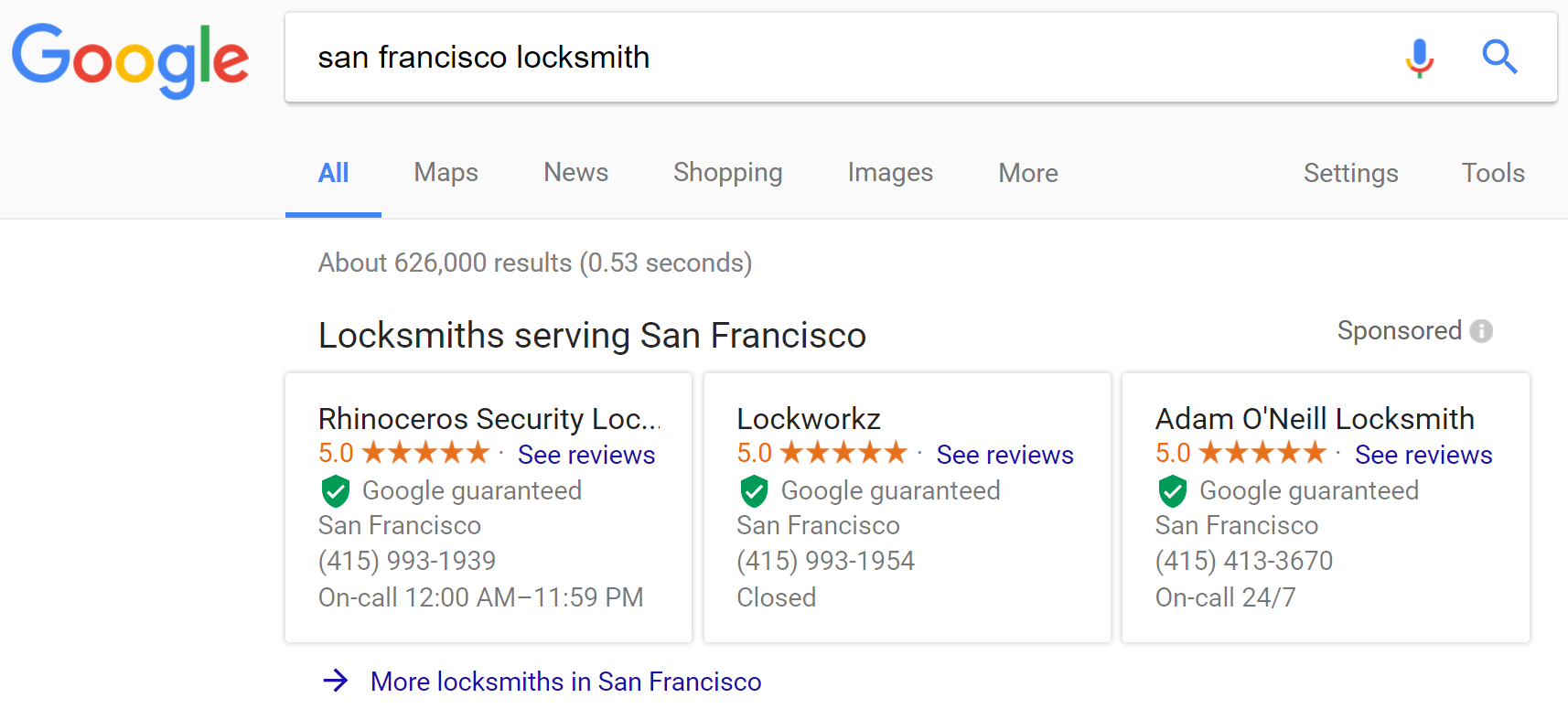
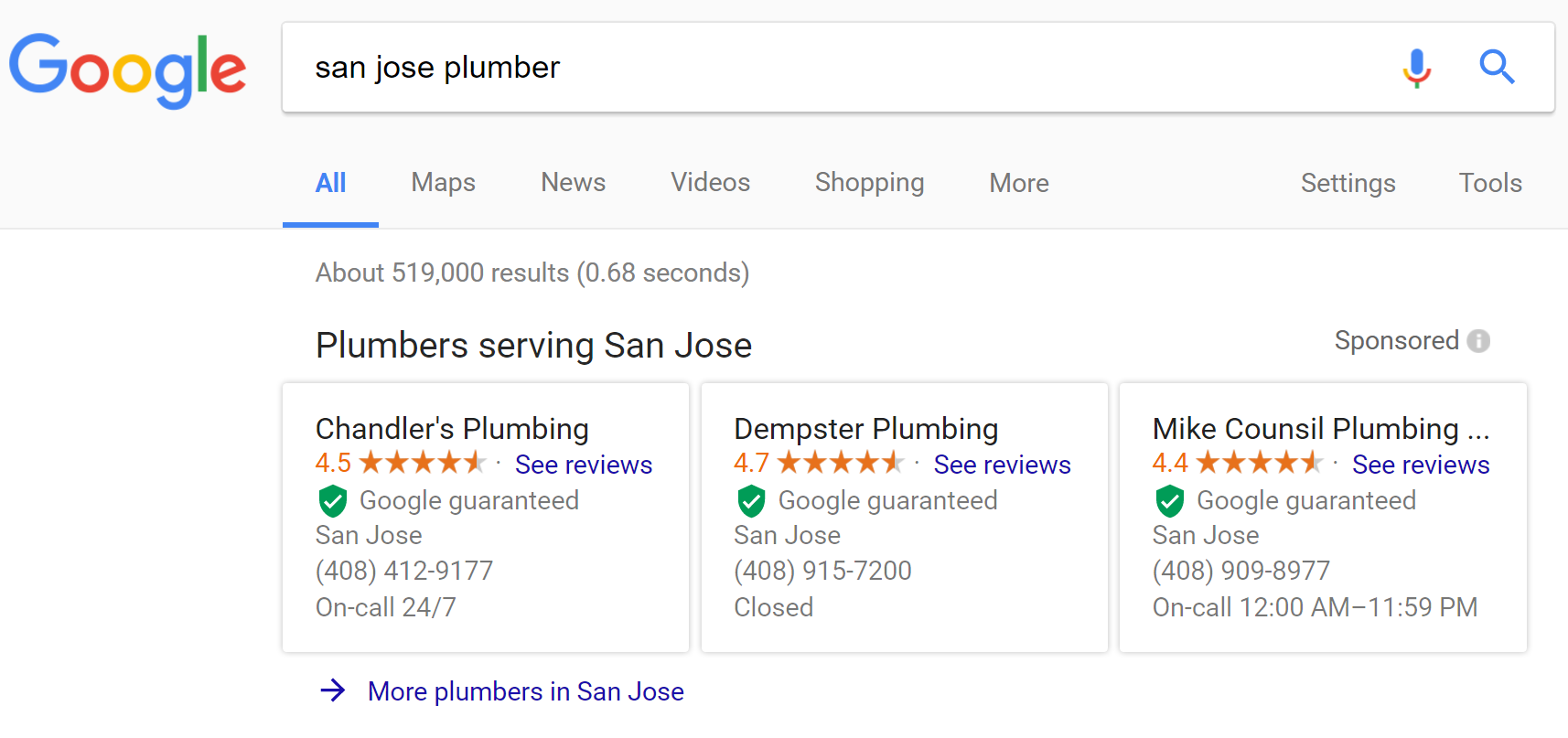
Here is the first style. While this appears carousel style, it is actually not a carousel, so Google is still only displaying 3 results on the search results page.


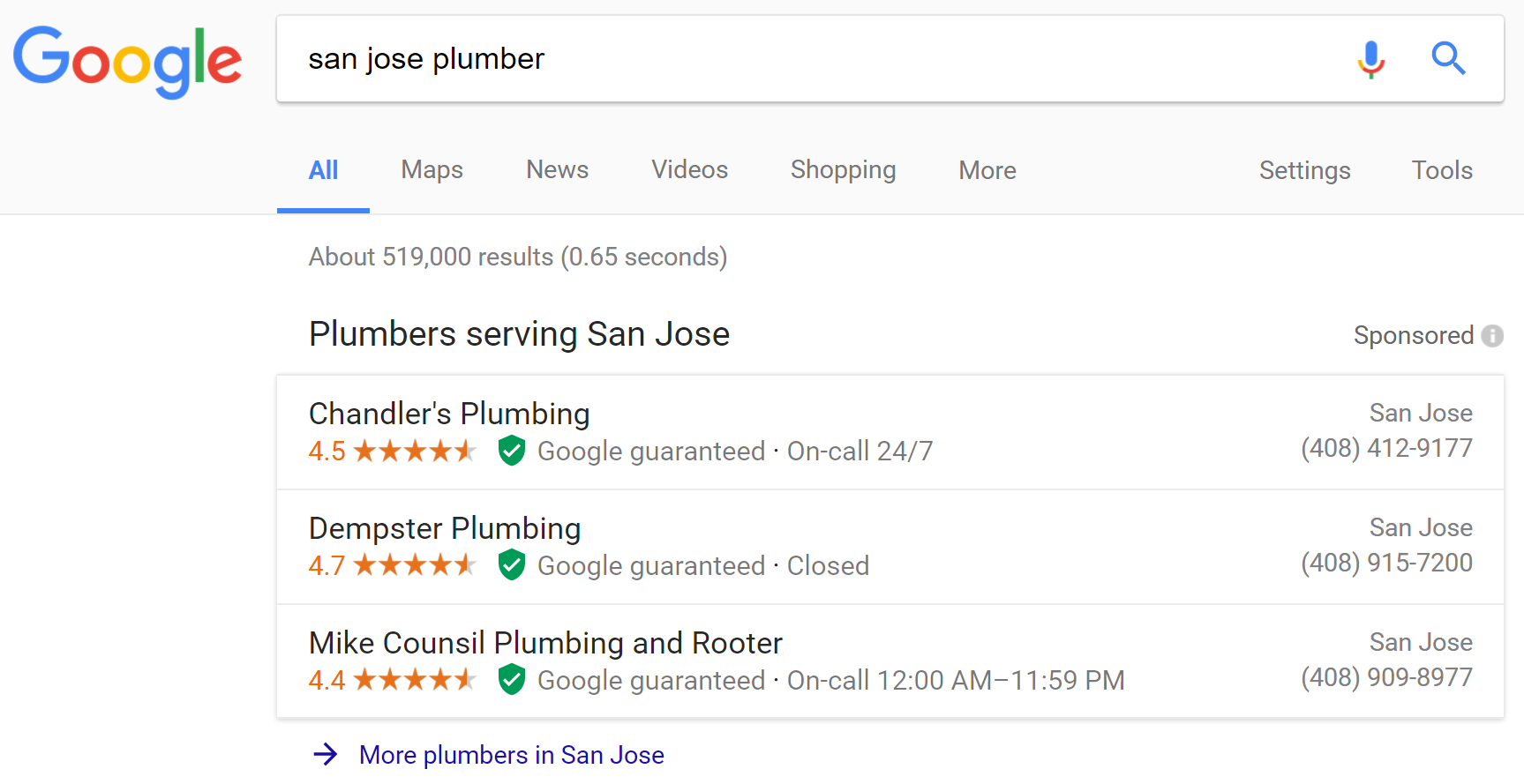
They are also testing a stacked version, again with only three results.

This stacked version is a much cleaner and simpler variation of the format Google was using previously.
Both versions add a “More <business> in <location>” note at the bottom, similar to how Google do at the bottom of local 3-packs in the search results. So searchers can still view more businesses if they don’t see a result they like in the three shown.