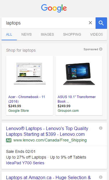
 We are used to seeing Google AdWords showing mobile Product Listing Ads that are in carousel style. It seems they are now testing a non-scrollable version that sees two individual product listing ads at the top of the search results instead of the multi-product carousel we primarily see in the mobile search results from Google.
Here is what it looks like:

This is notable since advertisers in the Product Listing Ads only have two product ad placements up for grabs – and in this case, Google has nabbed one of them for Chromebook.
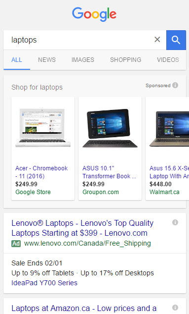
Here is how it normally looks like (and how it looked like when re-doing the identical search immediately after the above screenshot).

As you can see, this definitely isn’t an inventory issue for that particular PLA.
The two PLA strategy looks much cleaner when compared to the carousel style, however, it does mean the loss of some PLA spots. It was still the only spot for PLAs on the page, they didn’t add an additional PLA placement to make up for the loss of products.