 Google is testing additional line breaks in the Google search results for mobile users.
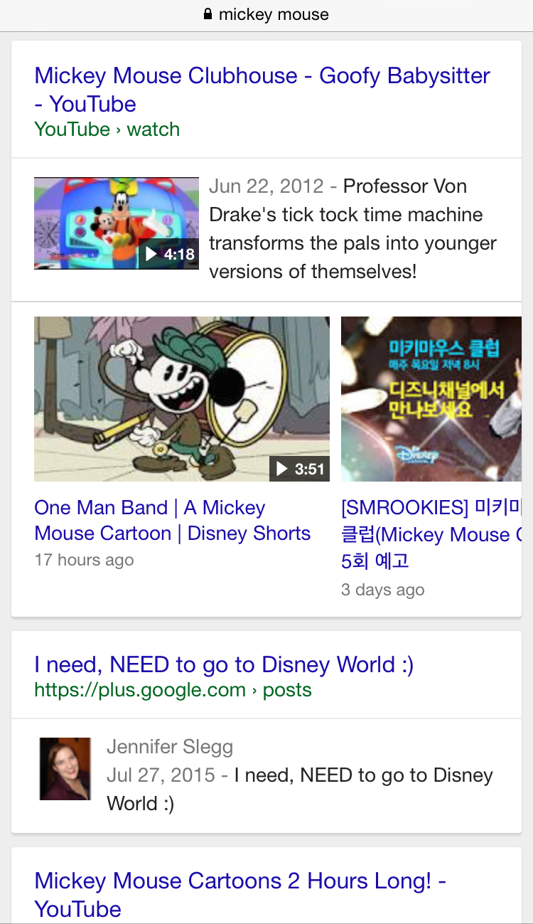
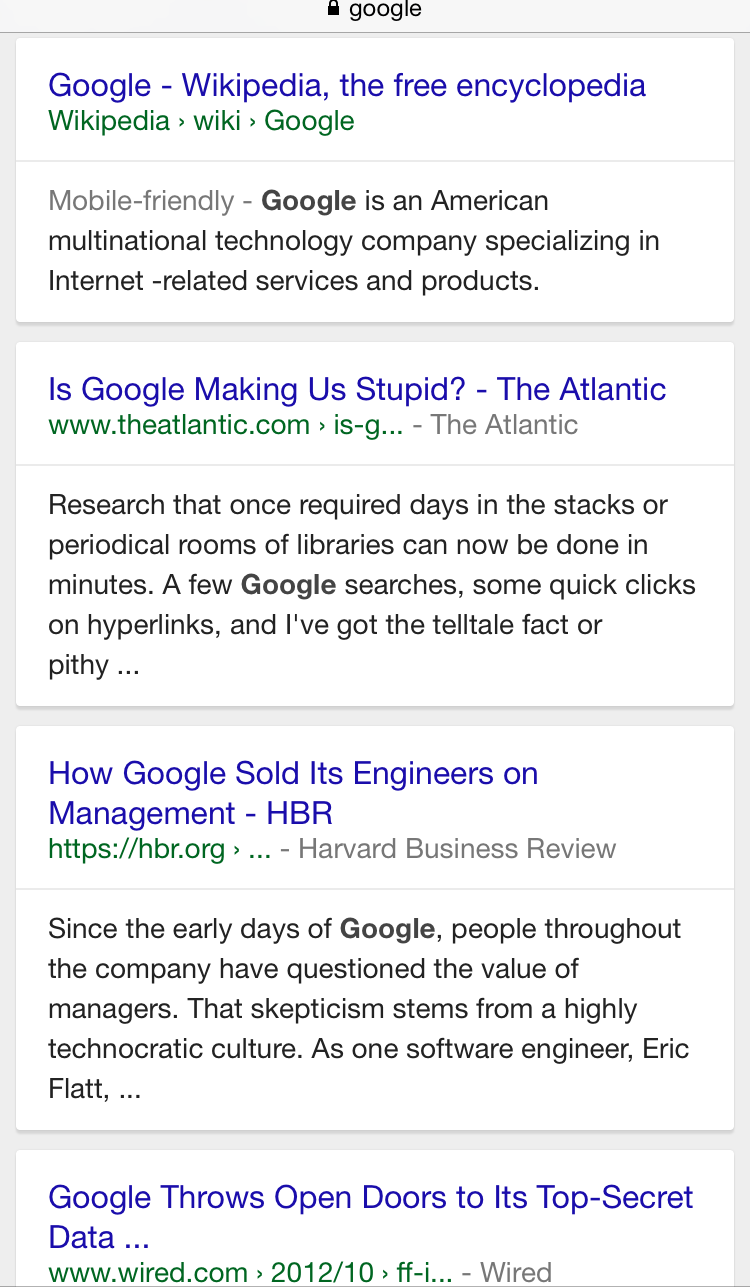
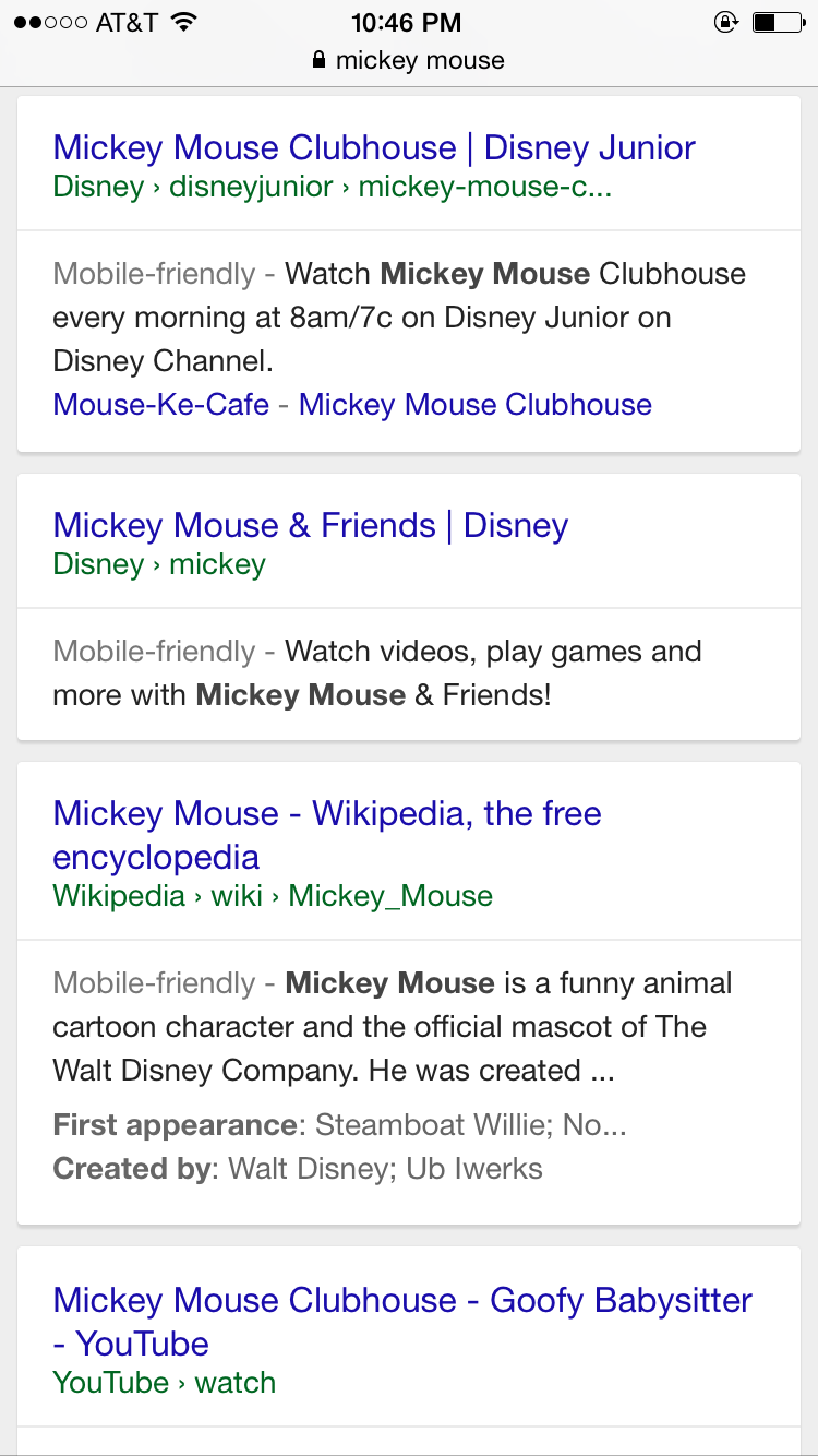
The change adds an additional line in between where Google displays the title/URL/breadcrumbs and the description snippet in the of each individual search result.
Here is how the additional breaks are appearing in the search results.
And another example:
Google is also displaying it for things like YouTube videos and Google+ posts that appear in the search results too.
 This test seems to be inspired by the additional line breaks that GoogleOS spotted in June, however this test also has the added card-look to each individual search result too. But this new variation with the cards makes it much easier to connect the listings together, as the old test made it a bit confusing and cluttered when trying to determine which results the snippets were for.
This is one of many Google UI tests Google has been testing in their search results this year, including the multi-color line breaks and colored lines between each search result.

