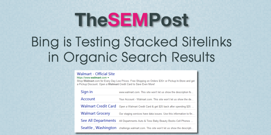
 Bing is running an interesting test for sites with sitelinks. Instead of the usual two columns of sitelinks and descriptions, Bing is testing a stacked version that runs across the entire width.
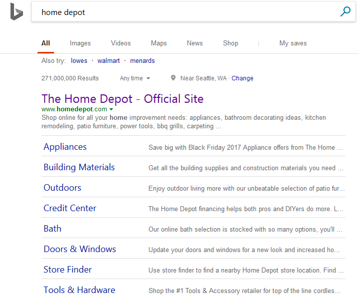
Here is what it looks like:

Even though this style catches the eye initially, it is actually much harder to quickly skim the information. Also, the description for the sitelinks awkwardly cuts off, and is for every example of this style of sitelinks we saw.
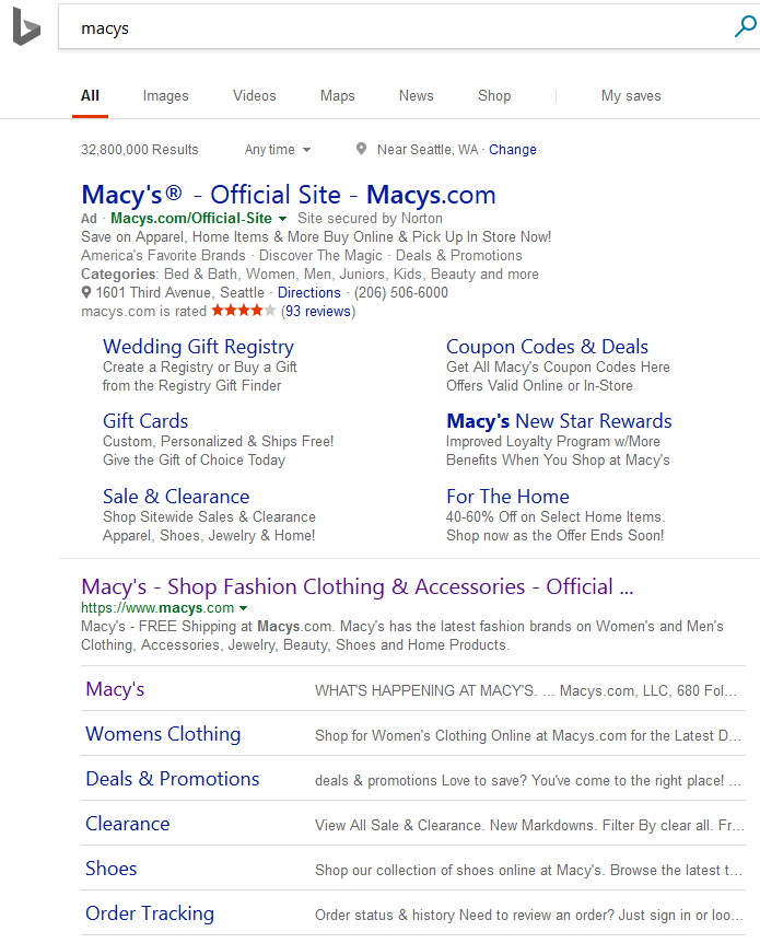
It doesn’t appear to be impacting Bing Ads sitelinks at all, only the organic non-paid search results. Here is an example with both a Bing Ads ad and an organic listing for the same site, with two different versions of the sitelinks.

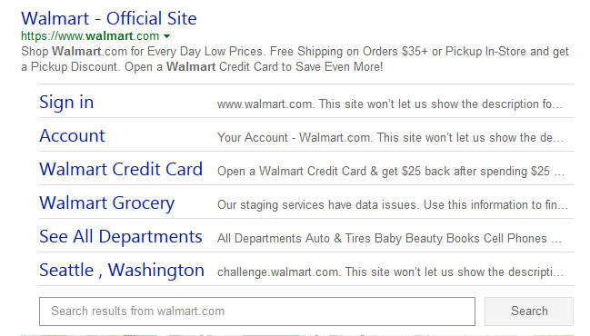
It also can include the sitelinks search box as well, showing up underneath the stacked sitelinks, as in this example:

This does seem to be a test and I have spotted it off and on since late last year.
Jennifer Slegg
Latest posts by Jennifer Slegg (see all)
- 2022 Update for Google Quality Rater Guidelines – Big YMYL Updates - August 1, 2022
- Google Quality Rater Guidelines: The Low Quality 2021 Update - October 19, 2021
- Rethinking Affiliate Sites With Google’s Product Review Update - April 23, 2021
- New Google Quality Rater Guidelines, Update Adds Emphasis on Needs Met - October 16, 2020
- Google Updates Experiment Statistics for Quality Raters - October 6, 2020