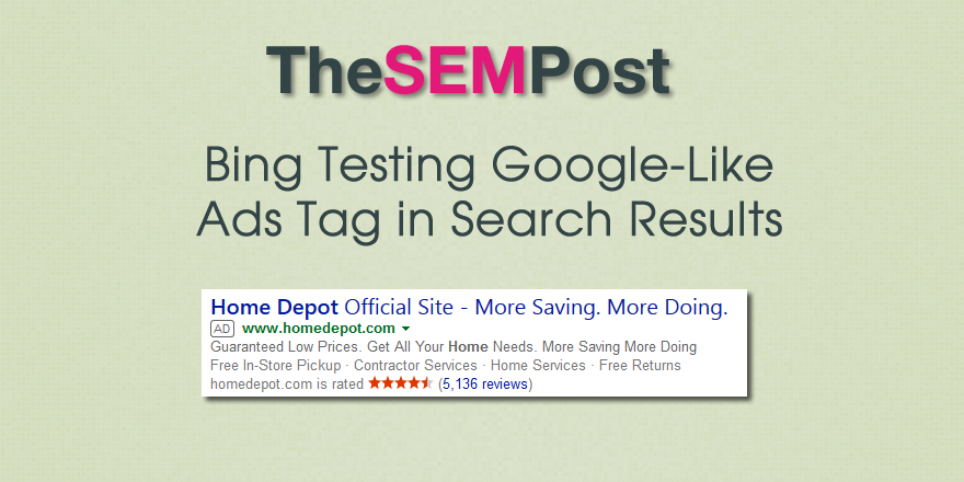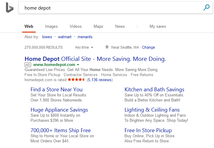
Here is what it looks like:

It also appears in their right hand sidebar ads as well.

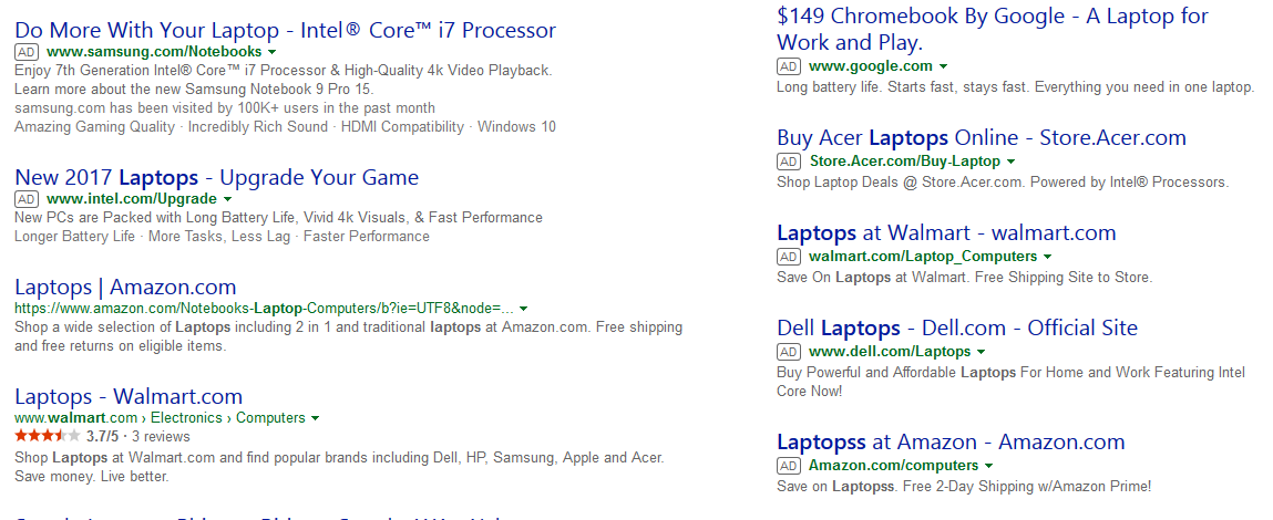
Here is how it normally looks:

While the new version they are testing is much more noticeable to alert a searcher that they are ads. And they still aren’t quite as noticeable as Google’s own version which is green in color.
This is a limited test, as I was not able to replicate it across all browser sessions.
Jennifer Slegg
Latest posts by Jennifer Slegg (see all)
- 2022 Update for Google Quality Rater Guidelines – Big YMYL Updates - August 1, 2022
- Google Quality Rater Guidelines: The Low Quality 2021 Update - October 19, 2021
- Rethinking Affiliate Sites With Google’s Product Review Update - April 23, 2021
- New Google Quality Rater Guidelines, Update Adds Emphasis on Needs Met - October 16, 2020
- Google Updates Experiment Statistics for Quality Raters - October 6, 2020