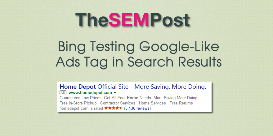
 Bing is running another test to make their “Ads” tag look nearly identical to the way Google marks up their own paid results in the search results.
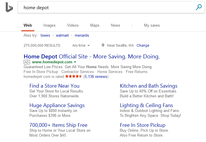
Here is what it looks like:

It also appears in their right hand sidebar ads as well.

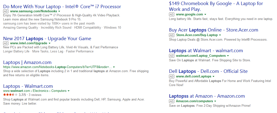
Here is how it normally looks:

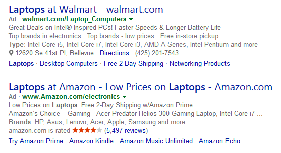
While the new version they are testing is much more noticeable to alert a searcher that they are ads. And they still aren’t quite as noticeable as Google’s own version which is green in color.
This is a limited test, as I was not able to replicate it across all browser sessions.
The following two tabs change content below.
Jennifer Slegg
Founder & Editor at The SEM Post
Jennifer Slegg is a longtime speaker and expert in search engine marketing, working in the industry for almost 20 years. When she isn't sitting at her desk writing and working, she can be found grabbing a latte at her local Starbucks or planning her next trip to Disneyland. She regularly speaks at Pubcon, SMX, State of Search, Brighton SEO and more, and has been presenting at conferences for over a decade.
Latest posts by Jennifer Slegg (see all)
- 2022 Update for Google Quality Rater Guidelines – Big YMYL Updates - August 1, 2022
- Google Quality Rater Guidelines: The Low Quality 2021 Update - October 19, 2021
- Rethinking Affiliate Sites With Google’s Product Review Update - April 23, 2021
- New Google Quality Rater Guidelines, Update Adds Emphasis on Needs Met - October 16, 2020
- Google Updates Experiment Statistics for Quality Raters - October 6, 2020