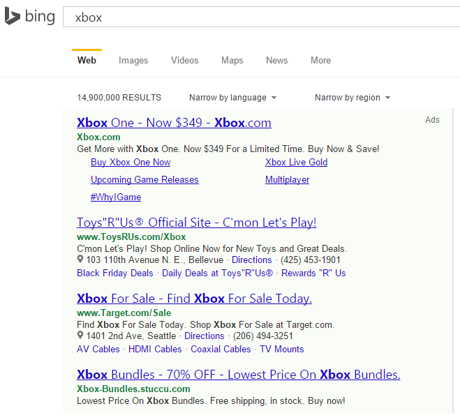
Bing is testing a green background in their ads in the Bing search results that appear above and below the organic search listings. This change is not exactly new, however it has not been seen for quite some time, after initially testing it back in October 2013.
 It also has the grey border on the right side of the ad unit, meant to differentiate the ads from knowledge graph content located on the right sidebar. It has the “Ads” notation on the top right, instead of the “Ads related to keyword” that normally appears.
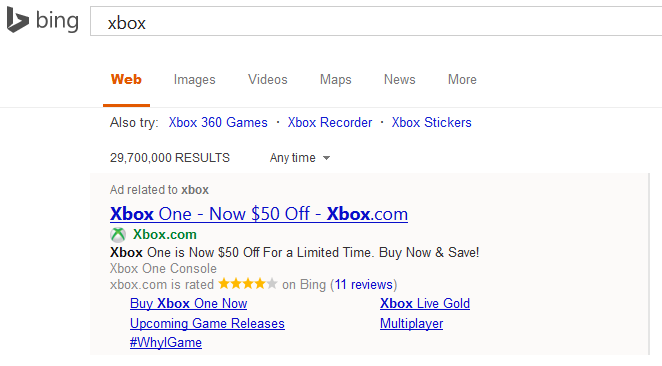
Here is an example of the same ad unit without the green shading.
 It is also very similar to the shading that Google AdWords used in the Google search results many years ago, before they changed background colors and eventually removing its altogether in lieu of the yellow ads tag.
Depending on the screen use, the green can be quite noticeable, such as on a desktop monitor, however it tends to become a lot harder to see on a laptop screen. For desktop searches, it definitely does attract the eye. It was only showing up for me in Chrome, the identical searches in Firefox produced the regular Bing Ads style.
It is also an interesting test right before the biggest shopping holiday season – which coincided with the same test last year.
It is one of the many Bing ads test that they have been testing in their search results over the last few months. Other tests include Twitter account follower numbers, how many visits a site has, categories, and consumer annotations.