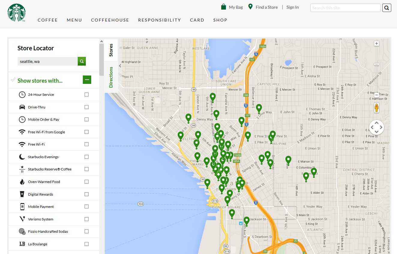
 As a frequent traveler, I use the store locator on a company’s website all the time. While some sites surpass expectations (thank you Starbucks!), others are so poorly done that I am likely to either skip a planned trip to the store or end up at a competitor’s website and business instead.
Here are the most common issues I come across with store locator pages, and how you can ensure you are following the best practices in each of these areas.
Zip code only
This is one of the most frustrating things about using store locators for travelers. I might be heading to Chicago next month and want to know if a brand has a store located there. I get to the website, and the only option to find a store is to enter a zip code (or postal code, depending on the location).
Right then, you are losing out on a potential visitor to your store – the tourist who might actually want to plan going to your store, but are thwarted by the zip code requirement.
So then, I have to go hit up Google, search for “Chicago zip code” and hope it might be one located somewhere near the downtown core of Chicago and not a suburb, then search for store locations.
If your IT department insists on offering locations by zip code, at least be considerate of out of towners who might actually want to shop in your store as well, and give them an option to search by city as well.
Here is an example of someone doing it right.
If you are only operating in 4 countries, why do you make users scroll through the nearly 200 countries to finally make it to the United States selection? While on desktop users can easily type “U” to force the selection to the top of the “U” listings, on mobile users are forced to scroll past them all.
If your business is located in Europe, it might make sense to include stores in nearby countries. But if you operate in Canada, the US and the UK, do you need to list all countries located in Africa or South America? No.
If your IT department insists on it, at the very least take pity on those on a mobile device and put the countries you actually operate in at the top of the list.
Give each location it’s own page
If your brand has more than 5 or so locations, stop placing them all on the same “store list” page, because it doesn’t help the searcher who might be searching for “Brand in Random Suburb USA”. If that random suburb happens to be the one you list 78th on the page, chances are good that other sites will come up first.
If you have locations faltering due to negative reviews on Yelp, make sure those individual locations have a solid page, so that location page on the brand site comes up before the 1 star rated Yelp page for the same location.
It is also a great place for additional helpful content beyond simply the address and phone number. Add store hours, special events for the location and if there are any specials for that specific location.
Don’t forget to make the location URL something useful like brand.com/bellevue/ rather than brand.com/location86/
Phone numbers
Are your phone numbers in plain text? I went to a mobile site recently where the web designer had made the store contact information and the phone numbers in a fancy font… in an image. So while I was attempting to contact the location, I had to memorize the phone number to enter it so I could make the call… and not everyone’s memory is good enough to remember those 12+ digits without having to go back and forth at least a couple of times.
The other important thing is that plain text phone numbers are then clickable from a mobile phone, making it easy for potential customers to reach you.
It isn’t hard to see how a potential customer would just phone a competitor with the question instead when a site’s designer decides to go for esthetics over functionality.
Don’t forget the amenities & features
Starbucks has a great store locator that allows you to select the type of store you would like, with many options like 24 hour locations and ones that sell specific specialty products.
Store hours
I am still amazed at how many businesses don’t list the store hours on the website, especially for smaller ones with odd hours. It is important you let people know you are closed on Mondays or you close early on Fridays so you don’t end up with disgruntled customers who will remember that experience and not attempt to return.
And try to refrain from the latest trend of “Find our store hours on Facebook” which some businesses are using lately, in hopes it might score a like or share in the process. Well, surprisingly, the entire world doesn’t use Facebook or they could be attempting to find out the information from work where Facebook is blocked. List your hours on Facebook, but don’t make it the only place that information is available.
Beware the Geotargeting
Yes, you might have some amazing stores in Canada and I might have even been to one. But unfortunately, some sites won’t actually allow you to access the store locator for another country than the one your IP is currently in. If you want to give the convenience of pre-setting the options for the country the visitor is in, at least give them the ability to find stores in other countries.
Another store I frequent while traveling recently began shipping to Canada. And with their new Canadian site they completely removed access to the store locator tool.
And yet another defaults all traffic to a specific location, regardless of which IP it comes from, and then shows stock information on every product based on their “popular store” location. But since the company has almost 400 locations across an entire country, odds are pretty good that one location will only match a tiny portion of their customer base.
Mobile Friendly Store Locator
If your site still isn’t getting the mobile-friendly boost in Google’s search results and is running a website that looks atrocious on mobile, at least make your homepage and store locator page mobile friendly.
While Google is usually pretty up to date, I once arrived at a store location that had clearly closed, despite Google and Yelp both saying it was open. So I went to the website but the virtually unusable on mobile store locator page on the company’s website made searching to see if the store had permanently closed or if they just moved to fancier digs a block away impossible to discover.
And yes, I later learned they moved to a store two blocks away that was three times as large, but their desktop only store locator page meant lost customers who were unable to find the new location on the website.
Maps
We still see sites merely linking to a screenshot of a map page with a star showing where their location is. Make it easy for those wanting to use Google Maps (or any other maps program) by including a link or displaying the Google Map right on the page. This way, potential customers just need to click to get to the larger map, especially if they are coming from a distance and trying to determine the best route to reach you.
Store photo
While it is nice to see the inside of the store, be sure to include a photo of the outside of the building, to help those trying to find your business from the street, especially if the businesses are small and close together, or where someone is trying to identify it while driving 30-40 mph. Sometimes those business signs aren’t as easy to spot as you’d think, no matter how much you paid for your fancy recognizable company logo.
Store locator pages seem like the simplest thing to add to a website, but many sites just don’t put any consideration into them other than listing locations and slapping on a map. All the nuances can make or break the ability for a customer to get the information that they are looking for fast.
Jennifer Slegg
Latest posts by Jennifer Slegg (see all)
- 2022 Update for Google Quality Rater Guidelines – Big YMYL Updates - August 1, 2022
- Google Quality Rater Guidelines: The Low Quality 2021 Update - October 19, 2021
- Rethinking Affiliate Sites With Google’s Product Review Update - April 23, 2021
- New Google Quality Rater Guidelines, Update Adds Emphasis on Needs Met - October 16, 2020
- Google Updates Experiment Statistics for Quality Raters - October 6, 2020


neale says
Perfect! just getting ready to overhaul a site with 6,000+ bicycle shops 🙂