Whatever anyone has to say about the future of Google Plus, I really like the platform in its current state.
It is more indepth than Twitter and less personal than Facebook and it gives lots of opportunities to establish yourself in the niche (at least certain niches like travel, technology and definitely search and social media marketing). Among other things, it works particularly great for consolidating your online activities (social media profiles, columns where you contribute, etc)
Among all major social media networks, Google Plus is the “friendliest” when it comes to personal branding and Google’s hover-over card is one of the most powerful branding tools helping us grow our presence on Google Plus.
The hover-over card is what we see when we hover over a name on Google Plus (within search results, on community pages, on your Google Plus home page, etc). Whenever you re-share something on your Google Plus page, the original update author will also have the hover-card (That’s why I always recommend sharing on Google Plus page first and then re-share it from there to your personal page: That’s how you have your business page hover-over card on your personal page!)
The hover-over card is a great marketing and branding tool:
- It makes positive first impression (and thus draw people in)
- It works well for branding giving anyone a quick, yet solid information on you and what you do;
- It helps grow your following: Hover-over cards are interactive (you can add the user to circles right from the hover-over card) while giving you a quick snippet of information on each person (thus prompting you to circle).
So what’s the anatomy of Google Plus hover-over card and how to make the most of it?
The 5 Components
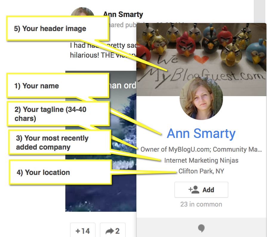
Your personal hover-over card consists of:
- Your name
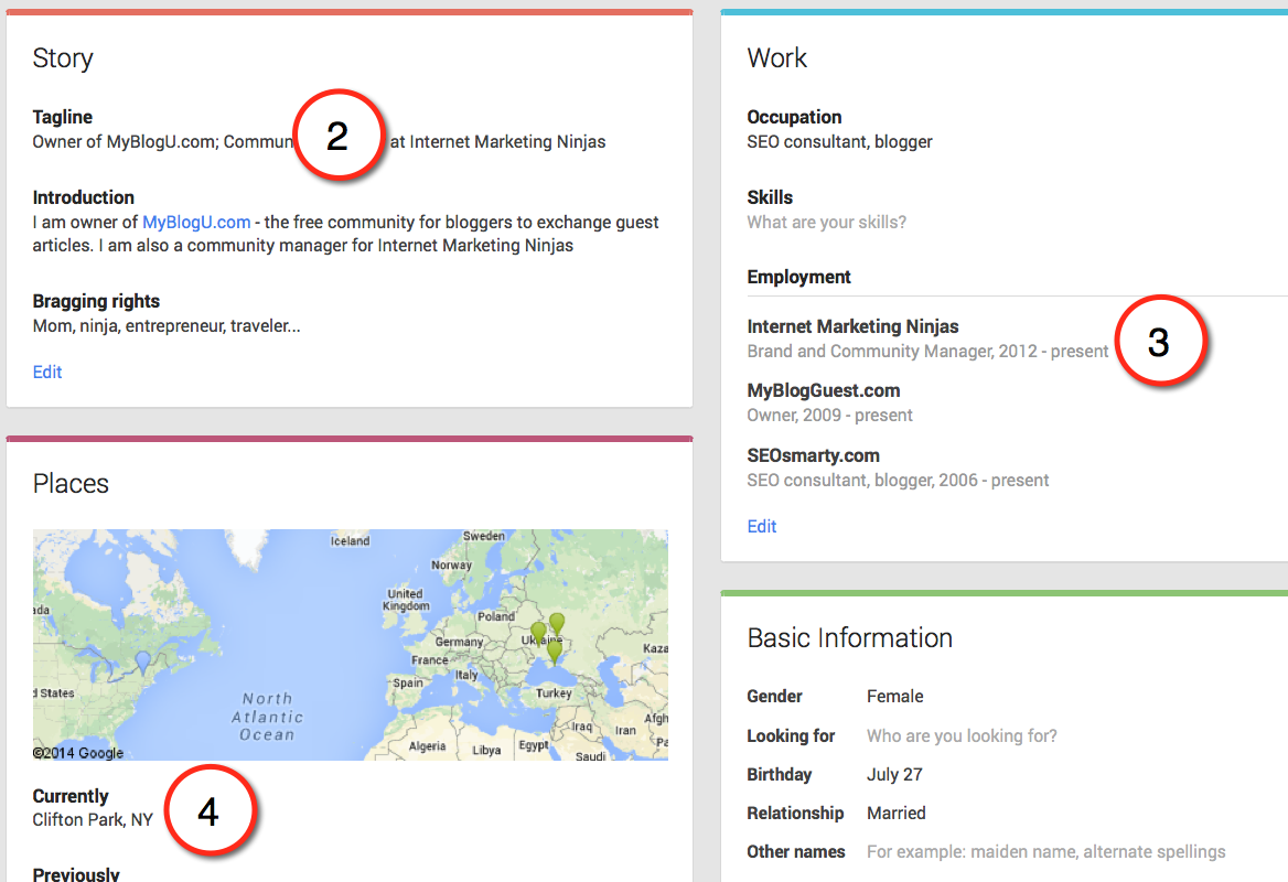
- Your tagline (usually first 36-44 characters / ~286 pixels of it; mine is 54 characters / 430px for some reason)
- Your most recently added company
- Your location
- Your header image:

So:

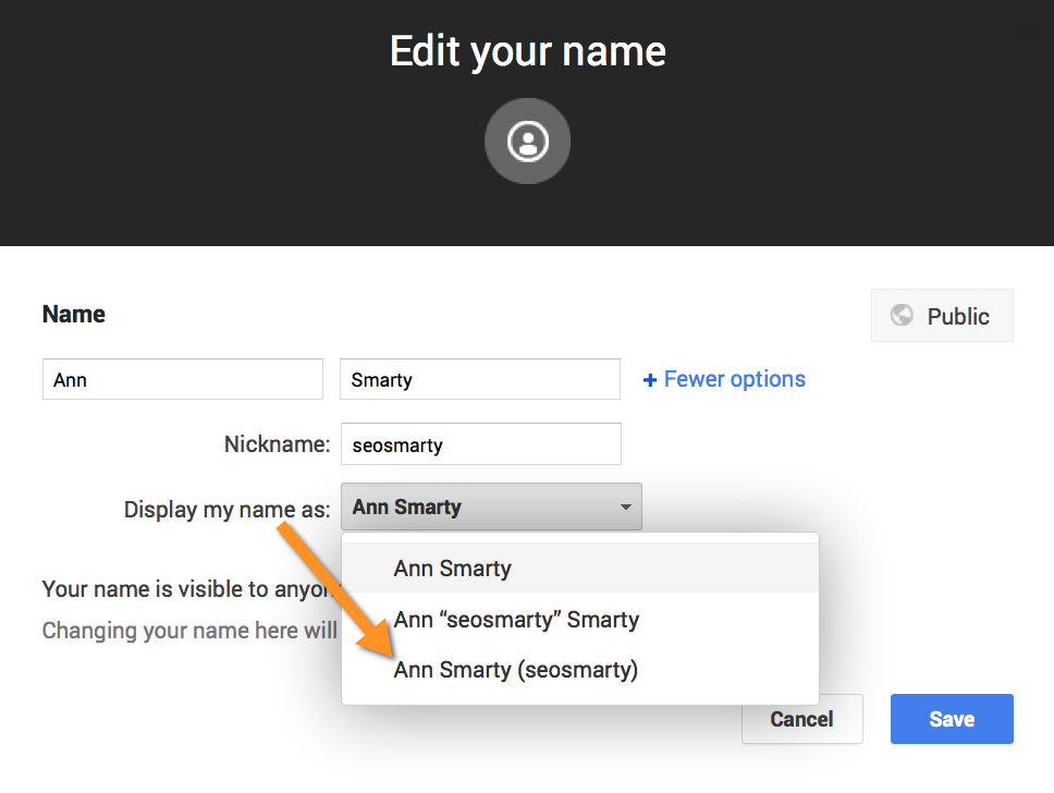
Now, you can also edit your name to include your professional moniker, nickname you go by within the family or friends or your middle name. In that case, you can change the hover-over card display as well by choosing to include your name there:

Note: This should be done by clicking on your name on your /+ProfileName/ (NOT on /about tab which also quite confusingly has “Other names” option)
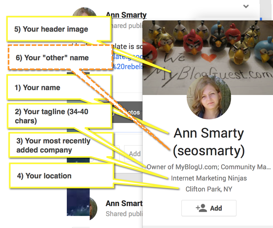
If you choose to add your moniker, your hover-over cards will get more descriptive (it’s a very handy feature especially if you are looking to consolidate your multiple online monikers):

Header / cover image
Google Plus header image is given much prominence both on your page and your hover-over card. While I would not suggest turning it into a promo banner, making sure it is memorable and catchy (as well as well-branded) is not a bad idea. It can be animated or you can just go crazy and show THE self in there:

There’s also a tool that helps editing images for them to become Google Plus friendly.
Businesses Hover-Over Card
Businesses have fewer options than people. All they have on their hover card is the name and the tagline.
There will also be a verified icon if it’s a verified local business.
Experimenting with hover-cards, you may see higher engagements and more connections. If you decide to try that out, please share your experience in the comments!
Ann Smarty
Latest posts by Ann Smarty (see all)
- 8 Marketing Dashboards and Alerts to Keep Your Team Organized - September 21, 2017
- How to Turn Youtube Channels into a Reputation Management Powerhouse - June 29, 2017
- Starting Out? 3 Sources of Traffic When Launching - October 7, 2016
- 3 Online Marketing Tools that Have Grown into Something Awesome This Year - August 30, 2016
- 2 Ways Google Suggest Can Expand Your Keywords Beyond Simply Completing Them - May 3, 2016
[…] my business page and then like and re-share them to my personal stream (to give more visibility to my business page hover-over card). To easily switch between the two, I am using the tips I’ve described in my article […]