 If you’ve ever tried bidding on competitor keywords in PPC, you know it’s not easy. Your ads may not even show due to low quality scores that are almost automatically assigned by the search engines. If you’re lucky enough to get impressions and clicks, it’s tough to get visitors to stay on your landing page.
Killer landing pages can help solve both of these problems. One reason why competitor keywords may get low quality scores is because most advertisers don’t want to mention the competition on their own site. Would Apple mention Microsoft on their site? No way. So you’re stuck with low quality scores.
But if you can develop an engaging landing page that serves the user well, you can often boost your quality score from a 2-3 to a 5-6. You’ll probably never get a 10, but 6 is better than 2.
In my travels around the web, I’ve seen a few impactful landing pages from advertisers targeting the competition. Here are 5 killer PPC landing pages for competitor keywords.
Free Trial and Debunking Claims
Free trials are a commonly-used customer acquisition tactic, and they’re especially effective when targeting competitor brands.
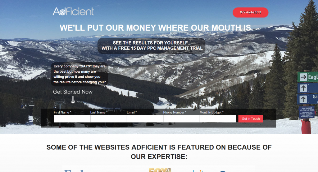
In this example, PPC management firm AdFicient offers a free trial, in an attempt to debunk claims from competing agencies claiming they’re the “best” at PPC management. The page includes a simple form to fill out to get started – another helpful tactic. If someone searches for your competition but then clicks on your ad, make sure you get the lead! This short form does just that.
Use Chat to Engage Visitors
Live chat is impactful for both new prospects and current customers – and it works great when targeting competitors.
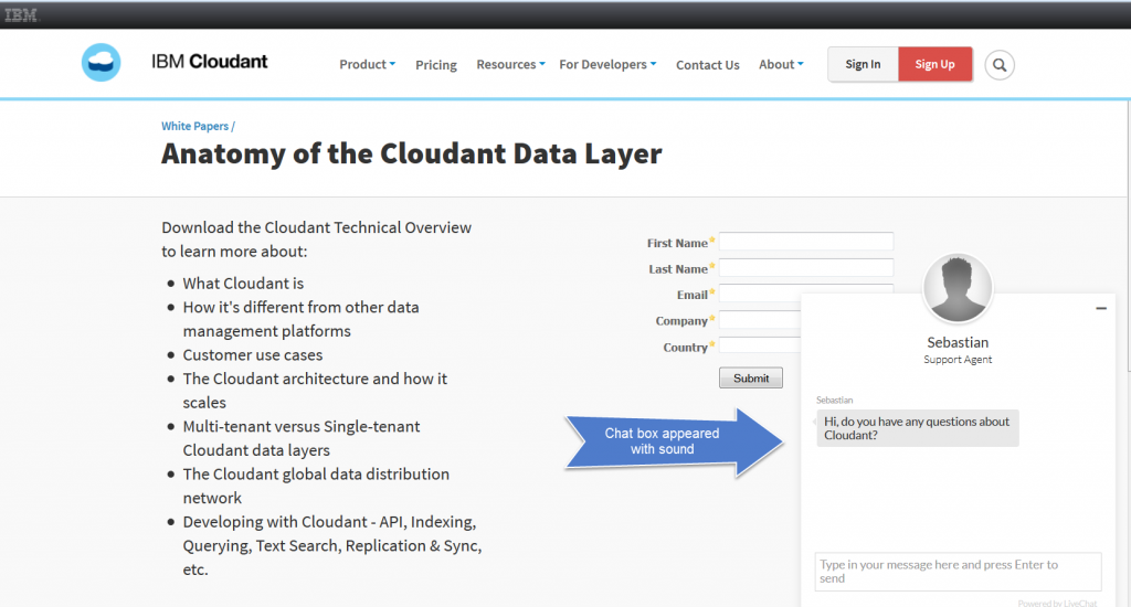
IBM showed this chat dialogue box after about 5 seconds on the landing page, with an agent offering to answer my questions about the product. The dialogue box popped up with a sound so I wouldn’t miss noticing it. Using live chat to engage a prospect who was looking for the competition is a great way to steer people toward your product or service with a personal touch.
IBM could add even more of a personal touch by using a photo of their agent, Sebastian, in the chat window instead of a generic “guy” silhouette.
Name Your Competitors & How You Stack Up
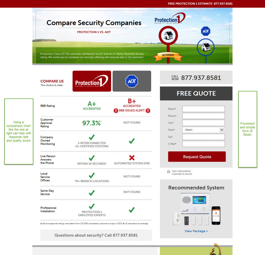
The “comparison grid” is one of my favorite landing page tactics for targeting competitors. Not only is it informative for the user, it helps you name your competitors on your landing page while still painting your company in a good light. Including the competitor name on your landing page may help boost your quality score, which is bound to be below average when bidding on the competition, so every little bit helps.
This landing page for Protection1 highlights the flaws of one of their largest competitors with red exclamation points. Protection1 is also using best practices for lead generation by including a prominent form and displaying their phone number multiple times.
Reviews & Ratings
What better way to position yourself against the competition than by letting your satisfied customers speak for you? Ratings and reviews offer valuable third-party proof that the user should choose you over someone else.
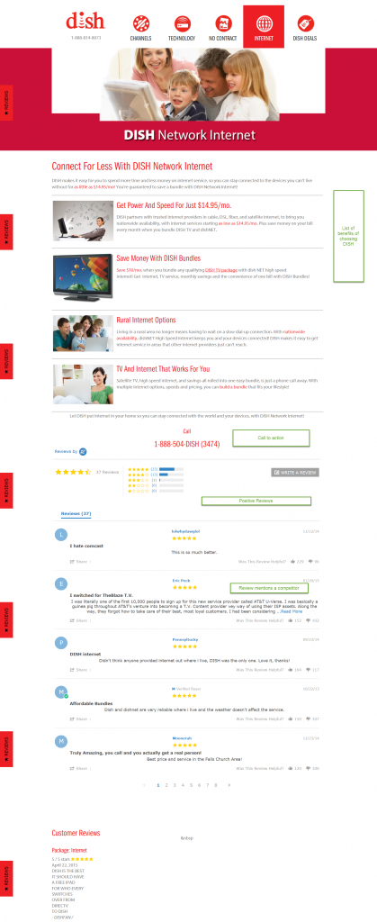
This landing page for DISH Network is so long it’s hard to read in a screen shot, but trust me – it’s impactful. Every review and rating displayed is a 5-star review. While this may seem less than authentic, hand-picking high reviews for a competitor landing page can work – especially when the reviews name and shame your competition. The very first review on the page starts with “I hate Comcast.” That’s powerful social proof right there.
The Kitchen Sink of Assets & Resources
Content marketing is widely used to nurture prospects and turn them into customers. Global Shop Solutions is making all of their content work for them when targeting competitors:
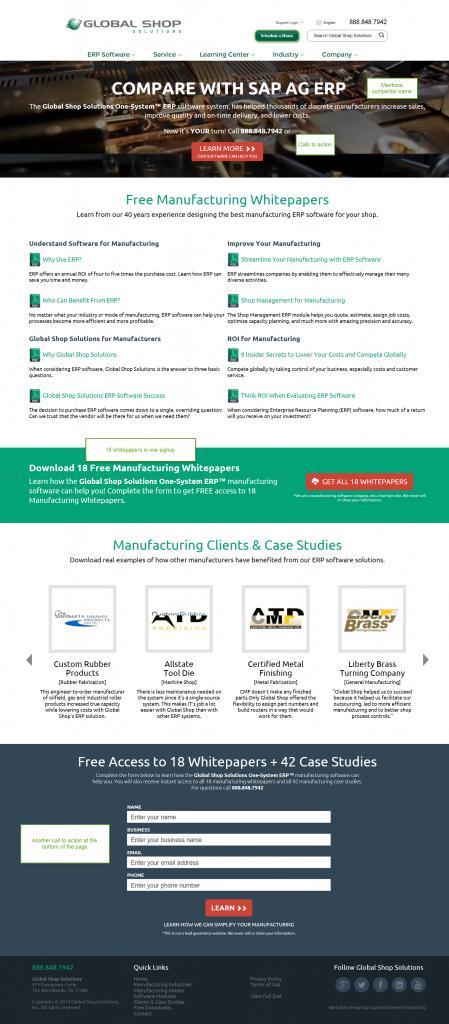
They do name their competitor, SAP, but that’s not what’s so great about this landing page. Visitors who sign up get free access to 18 whitepapers and 42 case studies. That’s probably most, if not all, of Global Shop Solutions’ entire content library on this product. They’re offering the kitchen sink to those who searched for another provider to try to sway them – in essence, making the visitor an offer they can’t refuse.
The next time you’re developing landing pages for competitor keywords, give one of these ideas a try. Offer the visitor something of value. Show how you measure up. Tell your story with third-party proof. And watch your results improve.
Christi Olson says
Great examples Mel! I love the screenshots you found to walk through the examples and show visually how other advertisers have worked around the issue. Top notch as always!
Adam Grabowski says
Melissa, great article and thank you for recognizing the results of my team and our agency of record at Global Shop Solutions. I look forward to reading more of your contributions to thesempost.