Many people aren’t fans of the local carousels that display in Google search results. They often look out of place with the black border, although they look better for mobile and tablet users. However, a new study shows just why Google isn’t putting much priority into redesigning them to look better – they increase ad clicks on the ads displayed below them.
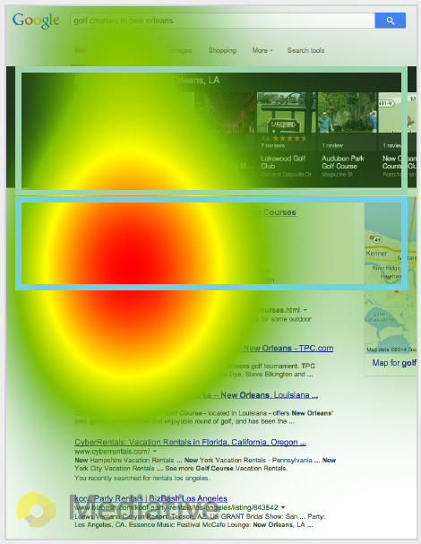
In an eye tracking study by Mediative, they discovered that most users aren’t spending much time viewing carousel results, and instead the focus of users is on the AdWords ads displayed directly below the carousel.
In fact, most users seemed to not interact with the carousel at all, looking at perhaps the first and second results from the left hand side of the carousel before focusing on the position where the AdWords ads appear.
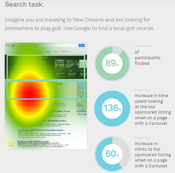
 On pages with a local carousel, users spent 136% more time on the sponsored listings than they did on pages without carousels.
This isn’t entirely surprising, as when there is a carousel of local results, AdWords ads can push the organic search results below the fold for many users with smaller screens.
Not all local searches have carousel results however. Mozcast shows that local carousels appear in between 1% and 1.2% of local searches.
Jennifer Slegg
Latest posts by Jennifer Slegg (see all)
- 2022 Update for Google Quality Rater Guidelines – Big YMYL Updates - August 1, 2022
- Google Quality Rater Guidelines: The Low Quality 2021 Update - October 19, 2021
- Rethinking Affiliate Sites With Google’s Product Review Update - April 23, 2021
- New Google Quality Rater Guidelines, Update Adds Emphasis on Needs Met - October 16, 2020
- Google Updates Experiment Statistics for Quality Raters - October 6, 2020
